by Calculated Risk on 6/23/2009 10:07:00 AM
Tuesday, June 23, 2009
Existing Home Sales Graphs
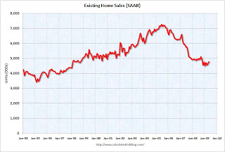
The previous post was the NAR release for May existing home sales. Here are some graphs ... Click on graph for larger image in new window.
The first graph shows existing home sales, on a Seasonally Adjusted Annual Rate (SAAR) basis since 1993.
Sales in May 2009 (4.77 million SAAR) were 2.4% higher than last month, and were 3.6% lower than May 2008 (4.95 million SAAR).
Here is another way to look at existing homes sales: Monthly, Not Seasonally Adjusted (NSA): This graph shows NSA monthly existing home sales for 2005 through 2009. Continuing the recent trend, sales (NSA) were lower in May 2009 than in May 2008.
It's important to note that the NAR says about one-third of these sales were foreclosure resales or short sales. Although these are real transactions, this means activity (ex-distressed sales) is much lower.  The third graph shows nationwide inventory for existing homes. According to the NAR, inventory decreased to 3.80 million in May. The all time record was 4.57 million homes for sale in July 2008. This is not seasonally adjusted.
Typically inventory increases in May, and then really increases over the next couple months of the year until peaking in the summer. This decrease in inventory was a little unusual, and the next few months will be key for inventory.
Also, many REOs (bank owned properties) are included in the inventory because they are listed - but not all. Recently there have been stories about a substantial number of unlisted REOs - this is possible. The fourth graph shows the 'months of supply' metric for the last six years.
Months of supply declined to 9.6 months.
Sales increased slightly, and inventory decreased, so "months of supply" decreased. A normal market has around 6 months of supply, so this is still very high. Here is another graph of inventory. This shows inventory by month starting in 2004.
Inventory in May 2009 was below the levels in May 2007 and 2008 (this is the 4th consecutive month with inventory levels below 2 years ago). Inventory levels have been below the year ago level for ten consecutive months.
It is important to watch inventory levels very carefully. If you look at the 2005 inventory data, instead of staying flat for most of the year (like the previous bubble years), inventory continued to increase all year. That was one of the key signs that led me to call the top in the housing market!
Note: there is probably a substantial shadow inventory – homeowners wanting to sell, but waiting for a better market - so existing home inventory levels will probably stay elevated for some time. And as noted above, there are also reports of REOs being held off the market, so inventory is probably under reported.
The final graph shows the year-over-year change in existing home inventory. If the trend of declining year-over-year inventory levels continues in 2009 that will be a positive for the housing market. Prices will probably continue to fall until the months of supply reaches more normal levels (closer to 6 months compared to the current 9.6 months), and that will take some time.
I'll have more on Existing Home sales tomorrow after New Home sales are released tomorrow.


