by Calculated Risk on 7/25/2009 12:49:00 PM
Saturday, July 25, 2009
Growth Forecasts after the Great Recession
From David Altig at Macroblog: A look at the recovery
Earlier this week my boss, Atlanta Fed President Dennis Lockhart, weighed in with his views about the shape of the economic recovery to come while speaking at a meeting of the Nashville, Tenn., Rotary Club:Dr. Altig then compares current forecasts for the recovery with previous recoveries."The economy is stabilizing and recovery will begin in the second half. The recovery will be weak compared with historic recoveries from recession. The recovery will be weak because the economy must make structural adjustments before the healthiest possible rate of growth can be achieved."
 Click on graph for larger image in new window.
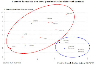
The red dots are actual recessions, the blue dots are forecast following the current recession.
The Y-axis on this graph is the four quarter percent change in GDP following the end of a recession. The X-axis is the depth of the recession (measure in change in GDP from peak to trough).
Note that the blue dots don't line up because the forecasters have different views as to the eventual depth of the recession.
From Altig:
The chart plots the four-quarter growth rate of gross domestic product (GDP) from the trough of a recession against the depth of the corresponding contraction, as measured by the cumulative loss of GDP over the course of the downturn. The points within the red circle represent all previous postwar recessions, and they form a nice, neat, easily discernible pattern. That is, the pace of growth in the first year after a recession has, in our history, been reliably related to how bad the recession was. The deeper the recession, the faster the recovery.I think this recession (and sluggish recovery) will continue to make history, and that most of these forecasts are actually too optimistic (the bottom 10 blue chip is about my view).
The points within the blue circle are based on forecasts of GDP growth from the third quarter of this year through the third quarter of 2010, obtained from the latest issue of Blue Chip Economic Indicators (which reports survey results from "America's leading business economists"). From top left of the circle to bottom right, the points represent the 10 lowest forecasts of the most optimistic members of the 50 Blue Chip forecasting panel, the panel's consensus (or average) forecast, and the 10 highest forecasts of the most pessimistic panel participants.
I chose the third quarter as the reference point because nearly two-thirds of the Blue Chip respondents indicate that, in their view, the recession will indeed end in the third quarter of this year. Assuming this occurs, this recovery would appear to be a big outlier. Either we are about to continue making history—and not in a good way—or current guesses about the medium-term economy are way too pessimistic.
emphasis added


