by Calculated Risk on 8/18/2009 10:00:00 AM
Tuesday, August 18, 2009
Comparing Housing Start Recoveries
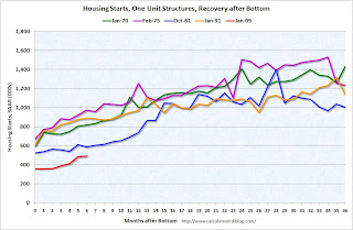
It appears that single-family housing starts bottomed in January of this year. Single-family starts in July were 37 percent above the January low - based on the seasonally adjusted annual rate (SAAR).
How does this compare to previous housing recoveries? Click on graph for larger image in new window.
The first graph compares the current recovery with four previous housing recoveries. The recoveries are labeled with the month that single-family housing starts bottomed.
Starts fell to record lows in the current housing bust (adjusted for changes in population, or number of households, would make the current bust even worse).
Usually housing starts increase steadily for the first two years following a housing bottom. The second graph shows the same data, normalized by setting the bottom for single-family housing starts to 100.
This graph shows that housing starts usually double in the two years following the bottom. Starts increased 80 percent over two years in the recovery following the Jan 1991 bottom, and 136 percent in the recovery following the Jan 1970 bottom.
If starts doubled over the two years following the Jan 2009 bottom, single-family starts would recover to 715 thousand by Jan 2011. And looking at the first graph some people might think single-family starts might recover to a 1.1 million rate within 2 years. That seems very unlikely.
I started this year looking for the bottom in single family housing starts (and I think the bottom is in), but I expect the recovery to be sluggish because of all the excess housing units, and also because of the ongoing decline in the homeownership rate. I'll have more on this later - but hopefully these graphs show what many people expect.


