by Calculated Risk on 8/26/2009 11:18:00 AM
Wednesday, August 26, 2009
Distressing Gap: Ratio of Existing to New Home Sales
For graphs based on the new home sales report this morning, please see: New Home Sales Increase in July
According to the Q2 Campbell national survey of real estate agents, over 63% of sales in Q2 were distressed. The number of distressed sales has probably declined in Q3, but it is still very high. The July NAR survey shows "distressed homes accounted for 31 percent of transactions", but their survey is very limited. And even using the NAR numbers, distressed sales are running around 1.5 million this year.
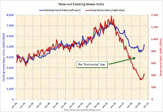
All this distressed sales activity has created a gap between new and existing sales as shown in the following graph that I've jokingly labeled the "Distressing" gap.
This is an update including July new and existing home sales data. Click on graph for larger image in new window.
This graph shows existing home sales (left axis) and new home sales (right axis) through July.
As I've noted before, I believe this gap was caused by distressed sales. Even with the recent rebound in new and existing home sales, the gap is still very wide. The second graph shows the same information, but as a ratio for existing home sales divided by new home sales.
Although distressed sales will stay elevated for some time, eventually I expect this ratio to decline back to the previous ratio.
The ratio could decline because of a further increase in new home sales, or a decrease in existing home sales - or a combination of both. I expect the ratio will decline mostly from a decline in existing home sales as the first-time home buyer frenzy subsides, and as the foreclosure crisis moves into mid-to-high priced areas (with fewer cash flow investors).
From a longer term graph of the ratio, see my post last month.


