by Calculated Risk on 8/16/2009 01:28:00 PM
Sunday, August 16, 2009
Health Care Spending and PCE
By request ...  Click on graph for larger image in new window.
The graph shows health care spending as a percent of GDP using three measures.
The first BEA measure, by major type of product, is of health care services as percent of GDP.
The larger BEA measure, by major function, includes health goods and services as a percent of GDP.
The Department of Health and Human Services includes investment in equipment and structures and is the broadest measure of health care spending. See here for a description of the HHS estimates:
These statistics, termed National Health Expenditure Accounts (NHEA), are compiled with the goal of measuring the total amount spent in the United States to purchase health care goods and services during the year. The amount invested in medical sector structures and equipment and in non-commercial research in the United States, to procure health services in the future, is also included.Here are the HHS estimates. (Note: 2008 in graph is based on HHS forecast).
The NHEA are generally compatible with the National Income and Product Accounts (NIPA), but bring a more complete picture of the health care sector of the nation’s economy together in one set of statistics.
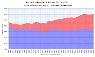
The second graph shows the broader BEA measure and Personal Consumption Expenditures (PCE) as a percent of GDP. (Note: we can't use the HHS measure because that includes investment, and investment is not included in PCE).
 Important: y-axis doesn't start at zero to better show the change in PCE from health spending - Please do not use to compare health spending to overall PCE (starting from zero percent would be better).
This graph was inspired by an article in Business Week by Michael Mandel: Consumer Spending is *Not* 70% of GDP (ht jb).
Note that PCE ex-health has actually declined slightly over the last 50 years, but health care related spending has increased sharply (not exactly news!).
Mandel writes:
First, the category of “personal consumption expenditures” includes pretty much all of the $2.5 trillion healthcare spending, including the roughly half which comes via government.This isn't quite correct. Healthcare spending will be around $2.5 trillion this year (according to the HHS), but that includes investment (see first graph). The portion included in PCE is about $1.9 trillion (the blue line in the first graph and red shaded area in second graph).
But the more important point is what will happen in the future. From a demographic perspective, these are the best of times for healthcare expenses. The original baby busters (from 1925 to the early 1940s) are now at the peak medical expense years, but their medical care is being heavily supported by the baby boomers (now in their peak earning years).
Here is an animation I made several years ago to show this point. The shows the U.S. population distribution by age from 1920 to 2000 (plus 2005).
Watch for the original baby bust (shows up in 1930). Those are the people currently in retirement.
Animation updates every 2 seconds.
Just some food for thought ...


