by Calculated Risk on 11/23/2009 10:42:00 AM
Monday, November 23, 2009
Existing Home Sales Graphs
Here is another way to look at existing homes sales: Monthly, Not Seasonally Adjusted (NSA): This graph shows NSA monthly existing home sales for 2005 through 2009. For the fifth consecutive month, sales were higher in 2009 than in 2008.
And for the second straight month, sales in 2009 were higher than in 2007 (two years ago).
Of course many of these transactions in October were due to first-time homebuyers rushing to beat the expiration of the tax credit (that has now been extended). This has pushed sales far above the historical normal level; based on normal turnover, existing home sales would be in the 4.5 to 5.0 million SAAR range.  The second graph shows nationwide inventory for existing homes. According to the NAR, inventory decreased to 3.57 million in October from the upwardly revised 3.71 million in September. The all time record was 4.57 million homes for sale in July 2008. This is not seasonally adjusted.
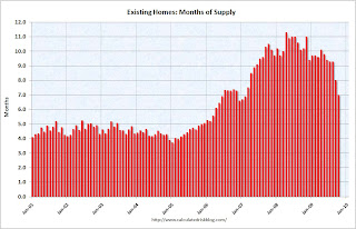
Typically inventory peaks in July or August, so some of this decline is seasonal. The third graph shows the 'months of supply' metric for the last six years.
Months of supply declined to 7.0 months in October.
Sales increased sharply, and inventory decreased, so "months of supply" declined. A normal market has under 6 months of supply, so this is still high - and especially considering sales were artificially boosted by the tax credit.


