by Calculated Risk on 2/21/2010 05:00:00 PM
Sunday, February 21, 2010
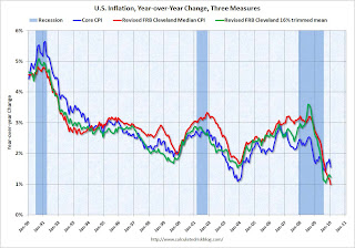
Graph of Core CPI, and Cleveland Fed Measures of Inflation
A combination of significant resource slack, and a policy of pushing down rents (an unintended consequence of the first time homebuyer tax credit), pushed core inflation (CPI minus food and energy) negative in January for the first time since 1982. This was no surprise.
Professor Krugman has more and suggests focusing on the Cleveland Fed measures of inflation:
[C]ore CPI has been behaving erratically lately, making me doubt whether it’s still a good guide to underlying inflation (by which I mean the trend in prices that, unlike commodity prices, have a lot of inertia).That inspired me to put all three measures on one graph:
What I find myself looking at these days are the Cleveland Fed “trimmed” inflation measures, which exclude outlying large price movements; the ultimate trim is the median, the rise in the price of the median category. And these indicators tell a story of dramatic disinflation in the face of a weak economy ... We may have to start calling the Fed chairman Bernanke-san, after all.
 Click on graph for larger image in new window.
This graph shows the year-over-year change in core CPI, and the two Clevelend Fed measures of inflation (median and trimmed mean). All three measures are moving down.
If we just look at the last three months, Core CPI is essentially unchanged and the Median is only up at about a 0.5% annual rate.
Despite all the talk about the Fed possibly raising the Fed funds rate in the 2nd half of 2010, with high unemployment and low measured inflation, it is very unlikely that the Fed will raise the Fed Funds rate any time soon - probably not until 2011 at the earliest.


