by Calculated Risk on 2/06/2010 12:38:00 PM
Saturday, February 06, 2010
Jobs and the Unemployment Rate
This is probably worth reviewing again, and I've added several graphs to show the relationship between net payroll jobs (establishment survey) and the unemployment rate (household survey) over different periods.
As I noted yesterday, a common question is: How could there be fewer payroll jobs, but the unemployment rate declined? This is because the data comes from two separate surveys. The establishment survey showed a loss of 20,000 payroll jobs in January, but the household survey showed an increase in the employment level of 541,000.
The number to use for jobs is the establishment survey, but the unemployment number is based on the household survey. The two surveys can diverge over the short period, but over time it will all work out. This was a hot topic last year when the unemployment rate decline to 9.4% in July, and some commentators wondered if the unemployment rate had peaked (see: Unemployment and Net Jobs).
Here are a series of graphs showing this relationship over several different periods.
The first graph shows the one month change in net jobs (on the x-axis) as a percentage of the payroll jobs, and the change in the unemployment rate on the y-axis.
The data is for the last 40 years: 1969 through January 2010. Click on graph for large image.
Obviously there is a correlation - the more jobs added (further right on the x-axis), the more the unemployment rate declines (y-axis). And generally the more jobs lost, the more the unemployment rate increases. But R2 is only 0.31 on a monthly basis - pretty noisy.
The large Red triangle (with arrow) is the most recent month. It is somewhat of an outlier, but still on the edge of the scatter pattern.
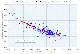
The second graph covers the same period but on a three month basis (note: this graph uses rolling three month periods, so the data is not all independent). Now we see a much sharper correlation. R2 is 0.69.
The red triangle is the most recent three month period, and this is somewhat of an outlier.
Note that the trend line is a 2nd order polynomial. When the economy starts to add jobs, more people start looking for work - and the relationship between net jobs and the unemployment rate is not linear.
Lets expand this to two longer periods: six months and one year. The third graph is for the six month change in payroll jobs and the unemployment rate. R2 is 0.79.
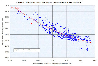
Once again the red triangle is for the most recent period. The change is on the edge of the scatter, but appears pretty normal. The increase in the unemployment rate is a little lower than expected over the last six months, probably because of the sharp decline in the number of people participating in the labor force. And the final graph is for the annual change. R2 is 0.81.
Once again this graph uses rolling periods, so the data is not independent.
The red triangle is for the most recent year, and is probably low because of the sharp decline in employment participation (one of the unusual features of the current employment recession).
So what does this mean going forward for the unemployment rate? It is probably reasonable to expect that the employment-population ratio has stopped falling. Therefore, to see consistent declines in the unemployment rate, we would probably have to see sustained payroll growth of over 150 thousand per month.
Since I expect the recovery to be sluggish, I wouldn't be surprised to see the unemployment rate at or near this level (or even higher) for some time.


