by Calculated Risk on 4/02/2011 11:42:00 AM
Saturday, April 02, 2011
Summary for Week ending April 1st
The BLS reported that payroll employment increased 216,000 in March and that the unemployment rate declined to 8.8%. If we average the first three months of 2011, there were 160,000 payroll jobs added per month. That is enough to keep up with the growth in the labor force, but to only reduce the unemployment rate slowly. Private payrolls were a little better with an average of 188,000 per month, as state and local governments continued to lay off workers (something we expect all year).
The decline in the unemployment rate from 8.9% to 8.8% was good news, especially since the participation rate was unchanged at 64.2%. Unfortunately the number of long term unemployed increased, as did the number of part time workers for economic reasons.
More disappointing news was that the average workweek declined slightly to 34.1 hours, and average hourly earnings was flat.
The March employment report was another small step in the right direction, but the overall employment situation remains grim: There are 7.25 million fewer payroll jobs now than before the recession started in 2007 with 13.5 million Americans currently unemployed. Another 8.4 million are working part time for economic reasons, and about 4 million more workers have left the labor force. Of those unemployed, 6.1 million have been unemployed for six months or more.
Most of the other stories remained the same - growth in manufacturing activity continues to be strong, and house prices declined further in January.
A key piece of disappointing news was the sluggish increase in real Personal Consumption Expenditures (PCE) in February. This suggests real PCE growth of only 1.4% in Q1, and has prompted several analysts to downgrade Q1 GDP growth.
Below is a summary of economic data last week mostly in graphs:
• March Employment Report: 216,000 Jobs, 8.8% Unemployment Rate
The first graph shows the employment population ratio, the participation rate, and the unemployment rate.
 Click on graphs for larger image in graph gallery.
The unemployment rate decreased to 8.8% (red line).
The Labor Force Participation Rate was unchanged at 64.2% in March (blue line). This is the lowest level since the early '80s. This is the percentage of the working age population in the labor force. The participation rate is well below the 66% to 67% rate that was normal over the last 20 years, although some of the decline is due to the aging population.
The Employment-Population ratio was increased slightly to 58.5% in March (black line).
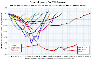
 The second graph shows the job losses from the start of the employment recession, in percentage terms aligned at maximum job losses. The dotted line is ex-Census hiring.
The current employment recession is by far the worst recession since WWII in percentage terms, and 2nd worst in terms of the unemployment rate (only the early '80s recession with a peak of 10.8 percent was worse).
 The third graph shows the job losses from the start of the employment recession, in percentage terms - this time aligned at the start of the recession.
Here are the employment posts yesterday with graphs:
March Employment Report: 216,000 Jobs, 8.8% Unemployment Rate
Employment Summary and Part Time Workers, Unemployed over 26 Weeks
Employment Graph Gallery
• Case Shiller: Home Prices Off to a Dismal Start in 2011
 This graph shows the nominal seasonally adjusted Composite 10 and Composite 20 indices (the Composite 20 was started in January 2000).
The Composite 10 index is off 31.4% from the peak, and down 0.2% in January (SA) (really a three month average of November, December and January). The Composite 10 is still 2.2% above the May 2009 post-bubble bottom.
The Composite 20 index is also off 31.3% from the peak, and down 0.2% in January (SA). The Composite 20 is only 0.7% above the May 2009 post-bubble bottom and will probably be at a new post-bubble low soon.
The next graph shows the price declines from the peak for each city included in S&P/Case-Shiller indices.
 Prices in Las Vegas are off 58% from the peak, and prices in Dallas only off 7.3% from the peak.
From S&P (NSA):
Continuing the trend set late last year, we witnessed 11 MSAs posting new index level lows in January 2011, from their 2006/2007 peaks. These cities are Atlanta, Charlotte, Chicago, Detroit, Las Vegas, Miami, New York, Phoenix, Portland (OR), Seattle and Tampa. These same 11 cities had posted lows with December’s report, as well.Both composite indices are still slightly above the post-bubble low (SA), but the indexes will probably be at new lows in early 2011.
• Personal Income and Outlays Report for Feburary
The following graph shows real Personal Consumption Expenditures (PCE) through February (2005 dollars).
 PCE increased 0.7% in February, but real PCE only increased 0.3% as the price index for PCE increased 0.4 percent in February.
 Personal income growth was slightly below expectations. Note: Core PCE - PCE excluding food and energy - increased 0.2 percent in February.
Even though PCE growth was at expectations, real PCE was low - and this suggests analysts will downgrade their forecasts for Q1 GDP. Using the two month estimate for PCE growth (averaging the growth of January and February over the first two months of the previous quarter) suggests PCE growth of around 1.4% in Q1 (down sharply from 4.0% in Q4).
• ISM Manufacturing Index increases in March
 PMI at 61.2%, slightly above expectations.
 From ISM: Economic activity in the manufacturing sector expanded in March for the 20th consecutive month ... The recent trend of rapid growth in the manufacturing sector continued in March, as the PMI registered above 60 percent for the third consecutive month. The component indexes of the PMI remain at very positive levels and signal strong sector performance in the first quarter. While manufacturers are benefiting from strength in new orders and production, there is significant concern with regard to commodity prices. Many manufacturers indicate the prices they have to pay for inputs are rising, and there is concern about the impact of higher prices on their margins." [said Norbert J. Ore, CPSM, C.P.M., chair of the Institute for Supply Management™ Manufacturing Business Survey Committee]
• U.S. Light Vehicle Sales 13.1 million SAAR in March
 This graph shows light vehicle sales since the BEA started keeping data in 1967.
Note: dashed line is current estimated sales rate. The current sales rate is finally off the bottom of the '90/'91 recession - and there were fewer registered drivers and a smaller population back then.
This was slightly below the consensus estimate of 13.2 million SAAR, possibly because of rising oil prices. I don't think the Japanese supply disruptions had any impact on sales.
• CoreLogic: Shadow Inventory Declines Slightly
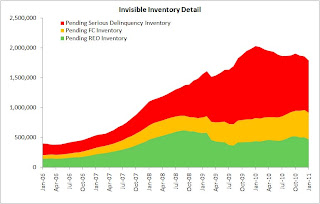
 From CoreLogic "the current residential shadow inventory as of January 2011 declined to 1.8 million units, representing a nine months’ supply. This is down slightly from 2.0 million units, also a nine months’ supply, from a year ago."
This graph from CoreLogic shows the breakdown of "shadow inventory" by category. For this report, CoreLogic estimates the number of 90+ day delinquencies, foreclosures and REOs not currently listed for sale. Obviously if a house is listed for sale, it is already included in the "visible supply" and cannot be counted as shadow inventory.
This report provides a couple of key numbers: 1) there are 1.8 million homes seriously delinquent, in the foreclosure process or REO that are not currently listed for sale, and 2) there are about 2 million current negative equity loans that are more than 50 percent “upside down”.
• Other Economic Stories ...
• Restaurant Performance Index increases in February
• Kansas City Manufacturing Survey at Record High, Chicago PMI Strong in March
• ADP: Private Employment increased by 201,000 in March
• From the Dallas Fed: Texas Manufacturing Activity Strengthens Further
• From the NAR: February Pending Home Sales Rise
• Unofficial Problem Bank List at 985 Institutions, Correction for Capitol Bancorp
Best wishes to all!


