by Calculated Risk on 7/30/2011 10:45:00 AM
Saturday, July 30, 2011
Summary for Week ending July 29th
The big economic story of the week was the Q2 GDP release. The Bureau of Economic Analysis (BEA) reported that real GDP growth increased a sluggish 1.3% annualized in Q2, and that growth was revised down to just 0.4% in Q1. Also the revisions indicated the recession was significantly worse than in earlier estimates.
On the political front, the U.S. government is still working towards raising the debt ceiling by this coming Tuesday. There are clear indications that the discussions in Washington have negatively impacted the economy over the last couple of weeks. Goldman Sachs economists write last night that their forecasts for ‘growth in Q4 and 2012 are under review for probably downgrade’. They argued the dysfunction in Washington is impacting confidence: “The inability of policymakers to agree on a measure to lift the federal debt ceiling has damaged consumer confidence, not to mention our own confidence ..."
In other news, sales of new homes are still moving sideways – and house prices, according to Case-Shiller, increased seasonally in May. The regional manufacturing surveys were slightly stronger in July than in June – but that isn’t saying much. Overall the economy remains very sluggish.
Here is a summary in graphs:
• New Home Sales in June at 312,000 Annual Rate
 Click on graph for larger image in graph gallery.
The Census Bureau reported New Home Sales in June were at a seasonally adjusted annual rate (SAAR) of 312 thousand. This was down from a revised 315 thousand in May (revised from 319 thousand).
The first graph shows New Home Sales vs. recessions since 1963. The dashed line is the current sales rate.
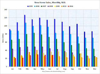
 This graph shows sales NSA (monthly sales, not seasonally adjusted annual rate).
In June 2011 (red column), 29 thousand new homes were sold (NSA). The record low for June was 28 thousand in 2010 (following the expiration of the homebuyer tax credit). The high for June was 115 thousand in 2005.
This was below the consensus forecast of 321 thousand, and was just above the record low for the month of June - and new home sales have averaged only 300 thousand SAAR over the 14 months since the expiration of the tax credit ... moving sideways at a very low level.
• Case Shiller: Home Prices increase in May
 From S&P: Some More Seasonal Improvement in Home Prices
This graph shows the nominal seasonally adjusted Composite 10 and Composite 20 indices (the Composite 20 was started in January 2000).
The Composite 10 index is off 31.8% from the peak, and up slightly in May (SA). The Composite 10 is 1.7% above the May 2009 post-bubble bottom (Seasonally adjusted).
The Composite 20 index is off 31.8% from the peak, and down slightly in May (SA). The Composite 20 is slightly above the March 2011 post-bubble bottom seasonally adjusted.
 Here are the price declines from the peak for each city included in S&P/Case-Shiller indices.
Prices increased (SA) in 9 of the 20 Case-Shiller cities in May seasonally adjusted. Prices in Las Vegas are off 59% from the peak, and prices in Dallas only off 9.5% from the peak.
From S&P (NSA):
As of May 2011, 16 of the 20 MSAs and both Composites posted positive monthly changes. Phoenix was flat. Detroit, Las Vegas and Tampa were the markets where levels fell in May versus April, with Detroit down by 2.8% and Las Vegas posting its eighth consecutive monthly decline. These three cities also posted new index level lows in May 2011. They are now 51.2%, 59.3% and 47.5% below their 2005-6 peak levels, respectively.• Real House Prices and Price-to-Rent
Case-Shiller, CoreLogic and others report nominal house prices. However it is also useful to look at house prices in real terms (adjusted for inflation), as a price-to-rent ratio, and also price-to-income (not shown here).
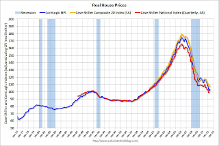
 This graph shows the quarterly Case-Shiller National Index SA (through Q1 2011), and the monthly Case-Shiller Composite 20 SA (through May) and CoreLogic House Price Indexes (through May) in real terms (adjusted for inflation using CPI less Shelter). Note: some people use other inflation measures to adjust for real prices.
In real terms, the National index is back to Q4 1999 levels, the Composite 20 index is back to August 2000, and the CoreLogic index back to March 2000. In real terms, all appreciation in the last decade is gone.
 In October 2004, Fed economist John Krainer and researcher Chishen Wei wrote a Fed letter on price to rent ratios: House Prices and Fundamental Value. Kainer and Wei presented a price-to-rent ratio using the OFHEO house price index and the Owners' Equivalent Rent (OER) from the BLS.
Here is a similar graph using the Case-Shiller Composite 20 and CoreLogic House Price Index (through May). This graph shows the price to rent ratio (January 1998 = 1.0). On a price-to-rent basis, the Composite 20 index is back to October 2000 levels, and the CoreLogic index is back to March 2000.
For more on home sales and house prices, here are the previous posts:
On June Home Sales:
• New Home Sales in June at 312,000 Annual Rate
• Existing Home Sales in June: 4.77 million SAAR, 9.5 months of supply
• Home Sales: Distressing Gap
• Graph Galleries: New Home Sales and Existing Home Sales
On House Prices:
• Case Shiller: Home Prices increase in May
• Real House Prices and Price-to-Rent
• Graph Galleries: Home Prices
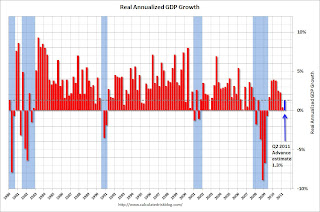
• Advance Estimate: Real Annualized GDP Grew at 1.3% in Q2
Note: This release contained a number of revisions. The recession was significantly worse than in earlier estimates. Last quarter (Q1) was revised down to just 0.4% real GDP growth.
 This graph shows the quarterly GDP growth (at an annual rate) for the last 30 years. The dashed line is the current growth rate. Growth in Q2 at 1.3% annualized was below trend growth (around 3.1%) - and very weak for a recovery, especially with all the slack in the system.
Not only has growth slowed, but the recession was significantly worse than earlier estimates suggested.
The following graph is constructed as a percent of the previous peak. This shows when GDP has bottomed - and when GDP has returned to the level of the previous peak. If the indicator is at a new peak, the value is 100%.
 This graph is for real GDP through Q2 2011 and shows real GDP is still 0.4% below the previous pre-recession peak. At the worst point, real GDP was off 5.1% from the 2007 peak. Since the most common definition of a depression is a 10%+ decline in real GDP, the 2007 recession was not a depression. Note: There is no formal definition of a depression. Some people use other definitions such as the duration below the previous peak. By that definition, using both GDP and employment, this seems like the "Lesser depression", but not by the common definition.
 This graph shows the rolling 4 quarter contribution to GDP from residential investment, equipment and software, and nonresidential structures. This is important to follow because residential investment tends to lead the economy, equipment and software is generally coincident, and nonresidential structure investment trails the economy.
 Note: red is residential, green is equipment and software, and blue is investment in non-residential structures. The usual pattern - both into and out of recessions is - red, green, blue.
The key leading sector - residential investment - has lagged this recovery because of the huge overhang of existing inventory. Usually RI is a strong contributor to GDP growth and employment in the early stages of a recovery, but not this time - and this is a key reason why the recovery has been sluggish so far.
For more on GDP, here are the posts:
• Advance Estimate: Real Annualized GDP Grew at 1.3% in Q2
• Real GDP still below Pre-Recession Peak, Chicago PMI declines, Consumer Sentiment Weak
• GDP: Investment Contributions (several graphs)
• ATA Trucking index increased 2.8% in June
 From ATA Trucking: ATA Truck Tonnage Index Jumped 2.8% in June
The American Trucking Associations’ advance seasonally adjusted (SA) For-Hire Truck Tonnage Index increased 2.8% in June after decreasing a revised 2.0% in May 2011. May’s drop was slightly less than the 2.3% ATA reported on June 27, 2011. The latest gain put the SA index at 115.8 (2000=100) in June, up from the May level of 112.6 and the highest since January 2011.Here is a long term graph that shows ATA's Fore-Hire Truck Tonnage index.
The dashed line is the current level of the index.
• Regional Manufacturing Surveys and the ISM index
This graph compares the regional manufacturing surveys and the ISM manufacturing index:
 The New York and Philly Fed surveys are averaged together (dashed green, through July), and five Fed surveys are averaged (blue, through July) including New York, Philly, Richmond, Dallas and Kansas City. The Institute for Supply Management (ISM) PMI (red) is through June (right axis).
The regional surveys were slightly better in July than in June. The ISM index for July will be released Monday, August 1st.
• Other Economic Stories ...
• From the Chicago Fed: Index shows economic growth again below average in June
• From the Dallas Fed: Texas Manufacturing Activity Picks Up
• From the Kansas City Fed: Manufacturing Sector Slows After Solid Rebound in June
• The Chicago Purchasing Managers reported activity stabilized in July
• Fed's Beige Book: "Pace of economic growth has moderated"
• Rumor: NAR Considering Introducing Repeat Sales Index
• From the NAR: Pending Home Sales Rise in June
• HVS: Q2 Homeownership and Vacancy Rates
Have a great weekend!


