by Calculated Risk on 8/06/2011 11:09:00 AM
Saturday, August 06, 2011
Summary for Week ending August 5th
This was a crazy week that people will long remember. On the political front, the U.S. government finally agreed to raise the debt ceiling. Unfortunately there were clear indications that the process negatively impacted the economy over the last couple of weeks.
In Europe, the financial crisis continued to spread. The President of the European Commission, José Manuel Barroso, finally acknowledged that containment has been lost and that the crisis has spread beyond Greece, Ireland and Portugal: “[I]t is clear that we are no longer managing a crisis just in the euro-area periphery.”
And on Friday, Standard & Poor’s downgraded U.S. debt to AA+. This will lead to related downgrades on Monday. However the regulatory agencies have already said there would be no change for risk-based capital purposes for financial institutions
There was plenty of economic data released too. Let’s start with employment:
The BLS reported that payroll employment increased 117,000 in July and that the unemployment rate decreased to 9.1%. So far the economy has added 1,148,000 private sector jobs this year, or 164,000 per month. There have been 930,000 total non-farm jobs added this year or 133,000 per month.
The pace of job growth has slowed over the last three months, and the overall pace is barely enough to keep up with the growth in the labor force. The unemployment rate has only declined from 9.4% in December 2010 to 9.1% in July. Mostly moving sideways ...
This was another weak employment report and reminds us that unemployment and underemployment are critical problems in the U.S. There are 6.8 million fewer payroll jobs now than before the recession started in 2007 with 13.9 million Americans currently unemployed. Another 8.4 million are working part time for economic reasons, and about 4 million more workers have left the labor force. Of those unemployed, 6.2 million have been unemployed for six months or more. Clearly the overall employment situation remains grim.
Other data was mostly weak too. The ISM manufacturing index declined to the lowest level since July 2009, and the ISM non-manufacturing index fell to the lowest level since early 2010. Auto sales were above expectations, although still below the pre-tsunami levels.
CoreLogic reported home prices increased in June, although the increase was mostly seasonal. And private construction spending increased slightly in June, although public spending is falling sharply.
On Friday, Goldman Sachs lowered their outlook through 2012: “We have lowered our growth forecast further and now expect real GDP to increase just 2%-2½% (annualized) through the end of 2012. Since this pace is slightly below the US economy’s potential, we now expect the unemployment rate to be at 9¼% by the end of 2012, slightly above the current level. We now see a one-in-three risk of renewed recession ...”
It was another very difficult week.
Here is a summary in graphs:
• July Employment Report: 117,000 Jobs, 9.1% Unemployment Rate
The BLS reported: "Total nonfarm payroll employment rose by 117,000 in July, and the unemployment rate was little changed at 9.1 percent ... The change in total nonfarm payroll employment for May was revised from +25,000 to +53,000, and the change for June was revised from +18,000 to +46,000."
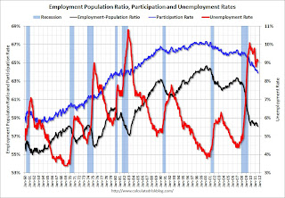
The following graph shows the employment population ratio, the participation rate, and the unemployment rate.
 Click on graph for larger image in graph gallery.
The unemployment rate decreased to 9.1% (red line).
The Labor Force Participation Rate declined to 63.9% in July (blue line). This is the percentage of the working age population in the labor force. This is a new cycle low - and the lowest participation rate since the early '80s.
The Employment-Population ratio declined to 58.1% in July (black line). This is also at a new cycle low and the lowest since the early '80s.
 This graph shows the job losses from the start of the employment recession, in percentage terms aligned at the start of the recession. The dotted line is ex-Census hiring.
This was a weak report, but better than expectations for payroll jobs, and the unemployment rate.
Here is the Employment graph gallery
• ISM Manufacturing index declines in July
 From the Institute for Supply Management: July 2011 Manufacturing ISM Report On Business®
PMI was at 50.9% in July, down from 55.3% in June. The employment index was at 53.5%, down from 59.9% and new orders decreased to 49.2%, down from 51.6%.
Here is a long term graph of the ISM manufacturing index.
This was below expectations of 54.3%, but in line with the weak regional surveys.
• ISM Non-Manufacturing Index indicates slower expansion in July
 From the Institute for Supply Management: July 2011 Non-Manufacturing ISM Report On Business®
The July ISM Non-manufacturing index was at 52.7%, down from 53.3% in June. The employment index decreased in July to 52.5%, down from 54.1% in June. Note: Above 50 indicates expansion, below 50 contraction.
This graph shows the ISM non-manufacturing index (started in January 2008) and the ISM non-manufacturing employment diffusion index.
This was below the consensus forecast of 54.0%.
• U.S. Light Vehicle Sales 12.23 million Annual Rate in July
 Based on an estimate from Autodata Corp, light vehicle sales were at a 12.23 million SAAR in July. That is up 6.1% from July 2010, and up 6.2% from the sales rate last month (June 2011).
This graph shows light vehicle sales since the BEA started keeping data in 1967.
Although still below the sales rate earlier this year - before the tragedy in Japan - this was above the consensus forecast of 11.9 million SAAR.
• Recession Measures
By request, here are four key indicators used by the NBER for business cycle dating: GDP, Employment, Industrial production and real personal income less transfer payments.
 Note: The following graphs are all constructed as a percent of the peak in each indicator. This shows when the indicator has bottomed - and when the indicator has returned to the level of the previous peak. If the indicator is at a new peak, the value is 100%.
These graphs show that no major indicator has returned to the pre-recession levels - and most are still way below the pre-recession peaks.
This graph is for real GDP through Q2 2011 and shows real GDP is still 0.4% below the previous pre-recession peak.
At the worst point, real GDP was off 5.1% from the 2007 peak.
 And real GDP has performed better than other indicators ...
This graph shows real personal income less transfer payments as a percent of the previous peak.
With the revisions, this measure was off almost 11% at the trough - a significant downward revision and shows the recession was much worse than originally thought.
Real personal income less transfer payments is still 5.1% below the previous peak.
 This graph is for industrial production through June.
Industrial production had been one of the stronger performing sectors because of inventory restocking and some growth in exports.
However industrial production is still 7.6% below the pre-recession peak, and it will probably be some time before industrial production returns to pre-recession levels.
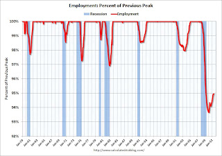
 The final graph is for employment. This is similar to the graph I post every month comparing percent payroll jobs lost in several recessions.
On the timing of the trough of the recession, GDP and industrial production would suggest the end of Q2 2009 (and June 2009). The other two indicators would suggest later troughs.
And of course the recovery in all indicators has been very sluggish compared to recent recessions.
• CoreLogic: Home Price Index increased 0.7% in June
 From CoreLogic: CoreLogic® Home Price Index Shows Third Consecutive Month-Over-Month Increase
This graph shows the national CoreLogic HPI data since 1976. January 2000 = 100.
The index was up 0.7% in June, and is down 6.8% over the last year, and off 31.7% from the peak.
Some of this increase is seasonal (the CoreLogic index is NSA) and the index is still off 6.8% from last June. This is also the eleventh consecutive month showing a year-over-year decline.
• Construction Spending increased in June
 The Census Bureau reported that overall construction spending increased slightly in June.
This graph shows private residential and nonresidential construction spending, and public spending, since 1993. Note: nominal dollars, not inflation adjusted.
Private residential spending is 65% below the peak in early 2006, and non-residential spending is 38% below the peak in January 2008.
Private construction spending is mostly moving sideways, and public spending is now falling sharply as the stimulus spending ends.
• Personal Income increased 0.1% in June, PCE decreased 0.2%
 The BEA released the Personal Income and Outlays report for June.
This graph shows real Personal Consumption Expenditures (PCE) through June (2005 dollars).
PCE decreased 0.2 in June, and real PCE decreased less than 0.1% as the price index for PCE decreased 0.2 percent in June. On a quarterly basis, PCE barely increased in Q2 from Q1 (this was in the GDP report Friday).
Real PCE has declined for three straight months - this was expected based on the weak GDP report, but this is very weak.
• Other Economic Stories ...
• ADP: Private Employment increased 114,000 in July
• European Commission President: Crisis no longer contained to periphery
• NMHC Quarterly Apartment Survey: Market Conditions Tighten
• States cutting Unemployment Insurance benefits
• FHA sells record number of REO in June
• LPS: Foreclosure Starts Increased in June
• Q2 2011 Details: Investment in Office, Mall, and Lodging, Residential Components
Have a great weekend!


