by Calculated Risk on 1/20/2012 12:35:00 PM
Friday, January 20, 2012
Existing Home Sales: Inventory and NSA Sales Graph
The NAR reported inventory fell to 2.38 million in December. This is down 21.2% from December 2010, and this is about 16% below the inventory level in December 2005 (2005 was when inventory started increasing sharply). Inventory is about 7% above the level in December 2004. This decline in inventory was a significant story in 2011.
The following graph shows inventory by month since 2004. In 2004 (black line), inventory was fairly flat and declined at the end of the year. In 2005 (dark blue line), inventory kept rising all year - and that was a clear sign that the housing bubble was ending.
 Click on graph for larger image.
This year (dark red) inventory is at the lowest level since 2004. Inventory is still elevated - especially with the much lower sales rate - but lower inventory levels put less downward pressure on house prices (of course the level of distressed properties is still very high, and there is a significant shadow inventory).
Note that inventory usually starts increasing in February and March, and peaks in July and August. The seasonal increase in inventory will be something to watch this spring and summer.
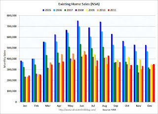
The following graph shows existing home sales Not Seasonally Adjusted (NSA).
 The red columns are for 2011.
Sales NSA are slightly above December 2009 and December 2010, but sales are far below the bubble years of 2005 and 2006.
The level of sales is still elevated due to investor buying. The NAR noted:
All-cash sales accounted for 31 percent of purchases in December, up from 28 percent in November and 29 percent in December 2010. Investors account for the bulk of cash transactions.Earlier:
Investors purchased 21 percent of homes in December, up from 19 percent in November and 20 percent in December 2010.
• Existing Home Sales in December: 4.61 million SAAR, 6.2 months of supply
• Existing Home Sales graphs


