by Calculated Risk on 2/03/2012 09:24:00 AM
Friday, February 03, 2012
Graphs: Unemployment Rate, Participation Rate, Jobs added
There were some revisions this morning to previous employment reports. This included the annual benchmark revision to state unemployment insurance (UI) records, and benchmarking the population controls to the 2010 Census data and an update to seasonal factors.
The benchmark revision increased total employment in March 2011 by 165,000 jobs - the first positive benchmark revision since 2006.
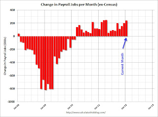
This graph shows the jobs added or lost per month (excluding temporary Census jobs) since the beginning of 2008.
 Click on graph for larger image.
Job growth started picking up early last year, but then the economy was hit by a series of shocks (oil price increase, tsunami in Japan, debt ceiling debate) - and now it appears job growth is picking up again.
The second graph shows the employment population ratio, the participation rate, and the unemployment rate. The unemployment rate declined to 8.3% (red line).
 The Labor Force Participation Rate declined to 63.7% in January (blue line). This is the percentage of the working age population in the labor force and is at the lowest since the early '80s. The decline in the participation rate is not good news even though it is pushing down the unemployment rate. The participation rate is well below the 66% to 67% rate that was normal over the last 20 years, although some of the decline is due to the aging population.
The Employment-Population ratio was unchanged at 58.5% in January (black line).
 The third graph shows the job losses from the start of the employment recession, in percentage terms. The dotted line is ex-Census hiring.
This shows the depth of the recent employment recession - much worst than any other post-war recession - and the relatively slow recovery due to the lingering effects of the housing bust and financial crisis.
This was a relatively strong report and well above consensus expectations. I'll have much more soon ...


