by Calculated Risk on 4/28/2012 04:14:00 PM
Saturday, April 28, 2012
The upward slope of Real House Prices
A year ago, Dave Altig asked Just how out of line are house prices?. Dr. Altig's post featured both a price-to-rent graph and a real house price graph originally from the NY Times based on Professor Robert Shiller's work.
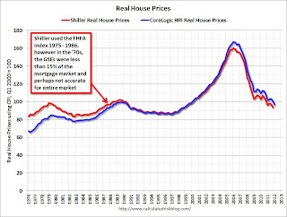
The price-to-rent ratio graph Dr Altig presented seemed to show that house prices were getting back to normal, but the graph based on Professor Shiller's work seemed to suggest that house prices could fall much further. Below is an updated graph from Shiller through Q4 2011.
The Shiller graph has suggested to many observers that house prices track inflation (i.e. that house prices adjusted for inflation are stable - except for bubbles). Last year I pointed out the slope depends on the data series used, and that if Professor Shiller had used either Corelogic or the Freddie Mac house prices series, before Case-Shiller was available, there would a greater upward slope to his graph.
An upward slope to real prices makes sense to me as I've argued before: "In many areas - if the population is increasing - house prices increase slightly faster than inflation over time, so there is an upward slope for real prices."
 Click on graph for larger image in new window.
This is the updated graph from Professor Shiller.
For the underlying data for the NY Times graphic, please see Professor Shiller's Irrational Exuberance website.
It is important to realize that Professor Shiller used the quarterly Case-Shiller National index starting in 1987. From 1975 through 1986 he used what is now called the FHFA index. He used other price indexes in earlier periods.
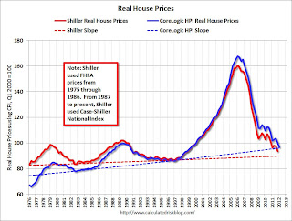
 The second graph shows the National Case-Shiller real prices and the CoreLogic HPI real prices (adjusted for CPI just like Shiller). For Q1, I used the February Corelogic index value.
The FHFA index used by Shiller was based on a small percentage of transactions back in the '70s. If we look at the CoreLogic index instead, there is a clear upward slope to real house prices.
If Professor Shiller had used the Freddie Mac quarterly index back to 1970 (instead of the PHCPI), there would be more of an upward slope to his graph too. So it is important to understand that for earlier periods the data is probably less accurate.
 The third graph shows the upward slope for both real price indexes. Even the Shiller "Irrational Exuberance" real price index has an upward slope (about 0.5% per year) - and the CoreLogic upward slope is steeper (about 1.5% per year).
Right now the real CoreLogic HPI is only slightly above the trend line (it could overshoot), and the Case-Shiller national index will probably be just above the trend line when the Q1 data is released.
This would suggest nominal prices are at the bottom (and real prices are close too). This is one reason I think the Case-Shiller and Corelogic house prices indexes probably stopped falling, NSA, in March 2012 (the March data will be released next month).
Earlier:
• Summary for Week ending April 27th
• Schedule for Week of April 29th


