by Calculated Risk on 5/04/2012 02:14:00 PM
Friday, May 04, 2012
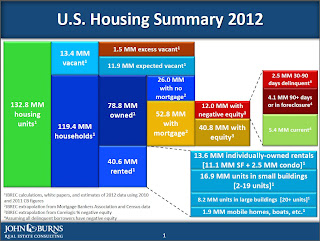
Graph: U.S. Housing Market Summary
Wayne Yamano at John Burns Real Estate Consulting sent me the following graphic last night. This provides a summary of the U.S. housing market in one graph.

Posted with permission: Source: John Burns Real Estate Consulting
The sources are listed on the graph. Wayne noted in his email to me: "We had to make some simplifying assumptions to make the chart look readable. One of those assumptions is that all delinquent borrows have negative equity. That’s obviously not true, but showing the overlap would have been exceedingly complicated."
The numbers on the left (total, vacant and occupied housing units) are extrapolations from the 2010 Census (the Census was a snapshot as of April 1, 2010 - over 2 years ago).
As an example, Yamano estimates that the number of housing units has increased from 131.7 million on April 1, 2010 to 132.8 million today. That is an increase of only 1.1 million housing units over the last two years - and that is probably close with the record low number of housing completions over that period.
I think the estimate of excess vacant housing units is too high. Using the Census 2010 state data, I estimated that the number of excess vacant housing units was above 1.8 million on April 1, 2010 (the date of the Census). See: The Excess Vacant Housing Supply. The number of excess units is lower today, and I think it is now less than 1 million units nationwide. A key difference is that I used both the 1990 and 2000 Census data to estimate the excess supply, and Yamano only used the 2000 Census data.
As Yamano noted, he made a "simplifying assumption" on delinquencies to make the chart readable (I think the chart is great). However it is important to remember that not all delinquent borrowers have negative equity, especially those in the 30 to 90 day delinquent category. Even in good times, around 2 million borrowers are one to two payments delinquent, and that is probably happening now too. This probably means there are another 1 to 2 million borrowers with negative equity that are current than shown on the chart. That is a key category since these properties could become distressed sales in the future - and that is why these borrowers are the main target of the HARP refinance program.
Also on delinquencies: I think the total of 6.6 million delinquencies is too high. Yamano used data from the MBA and extrapolated to the entire market, but the recent LPS release suggests there are about 5.6 million total delinquent loans (The MBA will probably show a significant decrease in Q1 too).
I think this graph provides a nice quick overview of the U.S. housing market. My thanks to Wayne.
Earlier on the employment report:
• April Employment Report: 115,000 Jobs, 8.1% Unemployment Rate
• April Employment Summary and Discussion
• All Current Employment Graphs


