by Calculated Risk on 6/30/2012 08:01:00 AM
Saturday, June 30, 2012
Summary for Week ending June 29th
The top economic story last week was the eurozone deal. From the Financial Times:
The agreement will result in EU bailout funds eventually being injected directly into teetering Spanish financial institutions, meaning Madrid can sweep the burden of the bailouts off its sovereign books.As always, beware of the details!
However, the rescue for Spain’s banks will only come after the creation of a single banking supervisor to be run by the European Central Bank.
The summit agreement also contained some concessions for Italy ... setting the stage for Rome to become the sixth eurozone country to request EU assistance ...
excerpt with permission
In the US, housing continues to improves, however manufacturing was soft in June - and consumer spending was flat in May. For housing, new home sales were up solidly, and house prices - as reported by Case-Shiller - increased in April. Also the Pending Home sales index increased 5.9% in May.
Here is a summary of last week in graphs:
• New Home Sales increased in May to 369,000 Annual Rate
 Click on graph for larger image in graph gallery.
The Census Bureau reports New Home Sales in May were at a seasonally adjusted annual rate (SAAR) of 369 thousand. This was up from 343 thousand SAAR in April. Sales in February and March were revised up.
The first graph shows New Home Sales vs. recessions since 1963. The dashed line is the current sales rate.
On inventory, according to the Census Bureau:
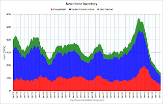
"A house is considered for sale when a permit to build has been issued in permit-issuing places or work has begun on the footings or foundation in nonpermit areas and a sales contract has not been signed nor a deposit accepted."Starting in 1973 the Census Bureau broke this down into three categories: Not Started, Under Construction, and Completed.
 This graph shows the three categories of inventory starting in 1973.
The inventory of completed homes for sale was at a record low 43,000 units in May. The combined total of completed and under construction is at the lowest level since this series started.
New home sales have averaged 353 thousand SAAR over the first 5 months of 2012, after averaging under 300 thousand for the previous 18 months. All of the recent revisions have been up too. This was a very solid report and above the consensus forecast.
• Case Shiller: House Prices increased in April
 S&P/Case-Shiller released the monthly Home Price Indices for April (a 3 month average of February, March and April).
This first graph shows the nominal seasonally adjusted Composite 10 and Composite 20 indices (the Composite 20 was started in January 2000).
The Composite 10 index is off 33.3% from the peak, and up 0.7% in April (SA). The Composite 10 is up from the post bubble low set in March, Not Seasonally Adjusted (NSA).
The Composite 20 index is off 33.0% from the peak, and up 0.7% (SA) in April. The Composite 20 is also up from the post-bubble low set in March (NSA).
 The second graph shows the Year over year change in both indices.
The Composite 10 SA is down 2.2% compared to April 2011.
The Composite 20 SA is down 1.9% compared to April 2011. This was a smaller year-over-year decline for both indexes than in March.
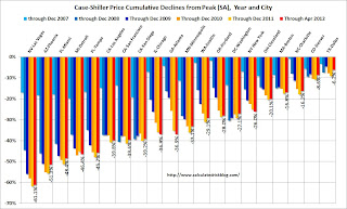
The third graph shows the price declines from the peak for each city included in S&P/Case-Shiller indices.
 Prices increased (SA) in 17 of the 20 Case-Shiller cities in April seasonally adjusted (18 cities increased NSA). Prices in Las Vegas are off 61.1% from the peak, and prices in Dallas only off 6.2% from the peak. Note that the red column (cumulative decline through April 2012) is the lowest for only a couple of cities.
This was better than the consensus forecast, and the NSA indexes are above the post-bubble lows set last month (NSA).
• Real House Prices and Price-to-Rent Ratio
Case-Shiller, CoreLogic and others report nominal house prices, and it is also useful to look at house prices in real terms (adjusted for inflation) and as a price-to-rent ratio. Below are three graphs showing nominal prices (as reported), real prices and a price-to-rent ratio. Real prices, and the price-to-rent ratio, are back to late 1998 and early 2000 levels depending on the index.
 This graph shows the quarterly Case-Shiller National Index SA (through Q1 2012), and the monthly Case-Shiller Composite 20 SA and CoreLogic House Price Indexes (through April) in nominal terms as reported.
In nominal terms, the Case-Shiller National index (SA) is back to Q4 2002 levels, and even with the recent small increase, the Case-Shiller Composite 20 Index (SA) is back to March 2003 levels, and the CoreLogic index (NSA) is back to May 2003.
 The second graph shows the same three indexes in real terms (adjusted for inflation using CPI less Shelter). Note: some people use other inflation measures to adjust for real prices.
In real terms, the National index is back to Q4 1998 levels, the Composite 20 index is back to March 2000, and the CoreLogic index back to February 2000.
As we've discussed before, in real terms, all of the appreciation in the '00s is gone.
 This graph shows a price to rent ratio using the Case-Shiller National, Composite 20 and CoreLogic House Price Indexes.
This graph shows the price to rent ratio (January 1998 = 1.0).
On a price-to-rent basis, the Case-Shiller National index is back to Q4 1998 levels, the Composite 20 index is back to March 2000 levels, and the CoreLogic index is back to April 2000.
In real terms - and as a price-to-rent ratio - prices are mostly back to late 1990s or early 2000 levels.
• Personal Income increased 0.2% in May, Spending decreased slightly
 The BEA released the Personal Income and Outlays report for May.
This graph shows real PCE by month for the last few years. The dashed red lines are the quarterly levels for real PCE. You can really see the slow down in Q2 of last year.
Using the two-month method, it appears real PCE will increase around 1.4% in Q2 (PCE is the largest component of GDP); the mid-month method suggests an increase of less than 1% in Q2. Also - so far - it appears spending is soft in June, so Q2 PCE growth will probably be fairly weak.
Another key point is the PCE price index has only increased 1.5% over the last year, and core PCE is up 1.8%. And it looks like the year-over-year increases will decline further in June.
• Weekly Initial Unemployment Claims mostly unchanged
 The DOL reports:
In the week ending June 23, the advance figure for seasonally adjusted initial claims was 386,000, a decrease of 6,000 from the previous week's revised figure of 392,000. The 4-week moving average was 386,750, a decrease of 750 from the previous week's revised average of 387,500.
The dashed line on the graph is the current 4-week average. The four-week average of weekly unemployment claims declined slightly to 386,750.
This is just off the high for the year.
• Regional Manufacturing Surveys
Regional surveys were mostly weak in June with the exception of the Dallas survey. From the Kansas City Fed: Growth in Tenth District Manufacturing Eased Further Activity Slowed
From the Richmond Fed: Manufacturing Activity Eased in June, But Expectations Remained Upbeat
From the Dallas Fed: Texas Manufacturing Activity Surges but Outlook Largely Unchanged
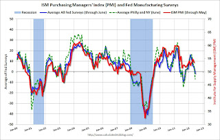
Here is a graph comparing the regional Fed surveys and the ISM manufacturing index:
 The New York and Philly Fed surveys are averaged together (dashed green, through June), and five Fed surveys are averaged (blue, through June) including New York, Philly, Richmond, Dallas and Kansas City. The Institute for Supply Management (ISM) PMI (red) is through May (right axis).
The ISM index for June will be released Monday, July 2nd, and these surveys suggest some decrease from the 53.5 reading in May.
• Other Economic Stories ...
• NAR: Pending home sales index increased 5.9% in May
• Housing: Inventory and Negative Equity
• A QE Timeline
• Consumer Sentiment declines in June to 73.2


