by Calculated Risk on 10/10/2012 12:26:00 PM
Wednesday, October 10, 2012
Further Discussion on Labor Force Participation Rate
On a Monday I wrote Understanding the Decline in the Participation Rate. Here are a few definitions - and a couple of graphs - that might help understand the issues.
Definitions from the BLS:
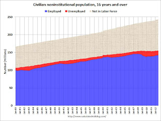
Civilian noninstitutional population: "consists of persons 16 years of age and older residing in the 50 States and the District of Columbia who are not inmates of institutions (for example, penal and mental facilities and homes for the aged) and who are not on active duty in the Armed Forces". If you look at the first graph below, the total of the Blue, Red, and light brown areas is the Civilian noninstitutional population.
"The civilian labor force consists of all persons classified as employed or unemployed". This is Blue and Red combined on the first graph.
"The labor force participation rate represents the proportion of the civilian noninstitutional population that is in the labor force." So this is Blue and Red, divided by all areas combined.
"The employment-population ratio represents the proportion of the civilian noninstitutional population that is employed." This is Blue divided by the total area.
"The unemployment rate is the number of unemployed as a percent of the civilian labor force." This is Red divided by Red and Blue combined. This is the REAL unemployment rate (some claim U-6 is the "real rate", but that is nonsense - although U-6 is an alternative measure of underemployment, it includes many people working part time).
 Click on graph for larger image.
There are some bumps in the total area - usually when there is a decennial census. These are due to changes in population controls.
Note that the Blue area collapsed in 2008 and early 2009, and started increasing in 2010. This shows the increase in employment over the last few years. Over the last few years, the red area (unemployment) has been decreasing.
However the combined area, the civilian labor force, has not increased much - even though the civilian noninstitutional population has been increasing. Some people argue that this evidence of a large number of people who left the labor force because of the weak labor market - and that the actual unemployment rate should be much higher than 7.8%.
However, as I noted on Monday, some decrease in the labor force participation rate was expected, and it appears most of the decline in the participation rate can be explained by demographic shifts.
 The second graph shows the number of people in the US by age group from both the 2000 and 2010 decennial Census.
This graph shows two key shifts. First, baby boomers now moving into lower participation rate age groups (look at increase in the 55-to-59 and 60-to-64 groups from 2000 to 2010).
A second key demographic is the significant increase in people in the 15-to-19 and 20-to-24 age groups. These groups have lower participation rates usually because of school enrollment - and enrollment has been increasing.
Taken together, it is clear why the labor force hasn't increase as quickly as the civilian noninstitutional population, and therefore, why a decline in the labor force participation rate was expected.


