by Calculated Risk on 5/26/2014 01:42:00 PM
Monday, May 26, 2014
Employment Graph Fail!
Reader MC sent me the following graph and asked "This chart looks highly questionable for a number of reasons. Any thoughts?"
Usually I ignore this nonsense, but I have a little extra time today - and this is an egregious example of "Graph Fail"

Click on graph for larger image.
Here is the apparent source of the graph.
The graph is constructed from the start of the 1982 and 2009 recoveries, and the graph subtracts the change in the Civilian noninstitutional population, 16 years and over, from the change in total non-farm payroll jobs.
This is just another way to ignore the change in demographics and the participation rate (that I've written about for years - and most research shows the decline in the participation rate is primarily due to changing demographics).
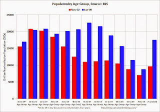
 Here is a quick look at demographics: This graph shows the population in each 5 year age group in November 1982 (red) and June 2009 (blue). This is the start of each recovery. Note: Not Seasonally Adjusted, Source: BLS.
In November 1982 (red), the two largest groups were in the "20 to 24" and "25 to 29" age groups. These people were just entering the prime working age! Is anyone surprised there was an increase in the overall participation rate during the '80s?
In June 2009 (blue), the two largest groups were in the "45 to 49" and "50 to 54" age groups . The older group was moving into a lower participation age group. And look at all those people in the 75+ group in 2009! That is good news - people are living longer - but most of these people are not participating in the labor force (the 75+ participation rate was 8.3% in April 2014).
And there are other long term demographic trends. As an example, in November 1982, 54.7% of the "16 to 19" age group participated in the labor force, and in 2009, only 38.5% participated (this is a long term trend and is mostly because more young people are staying in school - more good news).
So just ignore this graph. It is a Graph Fail!.
Note: The 1981 recession was primarily caused by then Fed Chairman Paul Volcker tightening monetary policy to fight inflation, and the recovery was directly related to the Fed easing policy. The 2007 recession was a direct result of the housing bubble and bust, and resulting financial crisis (all research shows recoveries from financial crisis are very difficult).


