by Calculated Risk on 1/11/2006 07:54:00 PM
Wednesday, January 11, 2006
US Migration Patterns
United Van Lines released their annual analysis of US migration patterns: Southeast, West Continue to Attract Residents as Midwest, Northeast See More Leave
United classifies each state in one of three categories -- "high inbound" (55% or more of moves going into a state); "high outbound" (55% or more of moves coming out of a state); or "balanced." Although the majority of states were in the "balanced" category last year, several showed more substantial population shifts.
What stands out to me is that California is seeing a net outflow for the first time since 1995. And Florida is "balanced" after years of net inflow. This is probably related to housing prices in both states.
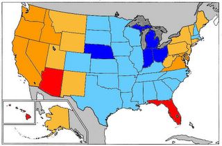
So lets compare migration to housing prices ... the following graph is house price appreciation based on the OFHEO House Price Index.

Click on graph for larger image.
Quarterly Appreciation:
Red: Greater than 20%
Dark Orange: 15% to 20%
Light Orange: 10% to 15%
Light Blue: 5% to 10%
Dark Blue: less than 5%
NOTE: D.C. is also red. These are annual rates of appreciation for Q4 2004 through Q3 2005. So this is not the exact same time period as the United analysis (calendar 2005). Q4 2005 is not yet available.
There are two regions seeing significant migration inflow: the West (excluding California) and the Southeast (excluding Florida). It is no surprise that western states like Arizona, Oregon, Nevada and Idaho have seen housing prices surge based on the migration data.
However, a similar pattern is not happening the Southeast. The states seeing inflows, like the Carolinas and Georgia, are not seeing above average house price increases. Perhaps there is more available land and higher rental vacancy rates.
Its no surprise that high outbound states like Michigan and Indiana are price laggards.


