by Calculated Risk on 1/03/2007 08:45:00 PM
Wednesday, January 03, 2007
MEW's Impact on 2007
First, I'd like to clarify a previous post on Mortgage Equity Withdrawal's (MEW) impact on GDP. Click on graph for larger image.
To construct this graph, I used the reported GDP for the previous year, and then removed 50% of the Greenspan-Kennedy MEW from GDP for the target year. The intention was to show how important MEW has been in recent years.
Note: the 50% is Greenspan estimate of MEW flowing to consumption of domestic goods and services.
From the questions I've received, I clearly didn't provide an adequate description of this chart. Or perhaps the presentation is misleading.
Let's use 2004 and 2005 as an example. In 2004, MEW was $754.2 Billion, and in 2005 MEW was $743.7 Billion (about the same). We could make two seemingly contradictory statements:
1) MEW contributed $372 Billion to GDP in 2005 (half of total MEW).
2) The change in MEW had no impact (positive or negative) on 2005 GDP growth, since MEW was the same in 2004 and 2005.
Both statements are correct, but since I presented the first statement in terms of the impact on GDP growth in the chart for each specific year, this was clearly confusing. To clarify further, let's look at 2007:
MEW's Impact on 2007 GDP
For 2006, my estimate of MEW is $521 Billion (first three quarters were $421 Billion). For 2007, I expect MEW to decline to around $300 Billion.
So, assuming Greenspan's 50% estimate is correct, what will be the drag on GDP in 2007?
Here is a simplified calculation: First, the change in MEW is $221 Billion ($521 Billion minus $300 Billion). So the estimated drag on consumption would be $110 Billion. If we assume 2006 GDP of $13.3 Trillion that would mean a drag of about 0.8% in 2007 due to the decline in MEW (see notes below).
Chart Caveats
Although the chart still makes perfect sense to me, it is clearly confusing to some (perhaps many) readers. If you use the chart, remember:
1) The MEW calculation ignores the impact of previous MEW on GDP. It is NOT cumulative. The calculation assumes MEW is a one time boost for each SPECIFIC year.
2) I'm using the Greenspan-Kennedy numbers provided by the Fed, but MEW is NOT an official statistic.
3) this chart assumes that 50% of MEW flows to domestic consumption. It is possible that more or less is used to pay off debt, for investment purposes, or flows to imports.
4) This chart also assumes that MEW flows to consumption in the year the MEW was extracted.
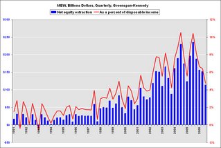
This will probably be the end of the above chart due to the confusion. I will be using this graph in the future to show the relative size of MEW. This graph is of the Greenspan-Kennedy MEW results, both in billions of dollars quarterly (not annual rate), and as a percent of personal disposable income.
Sorry for any confusion.


