by Calculated Risk on 10/30/2007 06:00:00 PM
Tuesday, October 30, 2007
Housing Busts and Sticky Prices
Even though the current housing bubble is probably the largest ever, both in price terms (relative to fundamentals) and geographically (the bubble was widespread), the bust is still following the normal pattern.
A typical housing bubble does not "pop", rather prices decline slowly, in real terms, over several years. This is because house prices display strong persistence and are sticky downward. Sellers tend to want a price close to recent sales in their neighborhood, and buyers, sensing prices are declining, will wait for even lower prices.
This means real estate markets do not clear immediately, and what we initially observe is a drop in transaction volumes, followed some time later by price declines. We are now observing price declines, with the Case-Shiller index indicating that U.S. home prices have fallen 4.5% over the last 12 months.
For how long will prices decline? Although we can draw some lessons from previous housing busts, we have to remember that different areas will experience different price declines.  Click on graph for larger image.
This graph shows the Case-Shiller price indices for several selected cities. This includes some of the more bubbly areas like Miami, San Diego and Las Vegas, and other areas with less of an increase in price (like Cleveland and Denver). In general, those areas with the largest price increases will probably also experience the largest price declines.
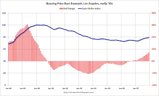
Each housing bust is somewhat unique, however prices declined for 5 to 7 years during most of the previous significant busts. We can use Los Angeles in the early '90s as an example of what happens to prices during a bust.
The second graphs show the Case-Shiller price index for Los Angeles from the late '80s until prices bottomed in 1996. The year-over-year change in prices is also shown.
Prices are sticky but not stuck. As a housing bubble peaks, appreciation slows at first (also transaction volumes decline and inventory rises - not shown), then prices start to decline. Then, about a year or so after the price peaks, prices really start to decline for a couple of years, followed by a couple more years of modest declines.
This graph is for nominal prices, in real terms prices declined almost 39% in LA during the early '90s bust. The third graph lines up the peak for the early '90s LA housing bust with the current nationwide U.S. housing peak. Using the previous bust as a guide - and with prices peaking about 15 months ago - the U.S. has probably just entered the two year period with the most severe price declines.
That is my expectation: we will see the most significant price declines for this cycle over the next two years, followed by more modest declines for a couple more years in the more bubbly areas.


