by Calculated Risk on 11/28/2007 05:39:00 PM
Wednesday, November 28, 2007
WSJ: Incorrect Home Price Graph
 The WSJ included this graph in a story on consumers: Consumer Gloom Adds to Recession Risk
The problem with this graph is that this isn't the Case-Shiller U.S. Home price index; this is the year over year graph for the Case-Shiller Composite 10 price index.
This minor mistake does help understand the differences between the various price indices. Case-Shiller has indices for 20 cities, plus two composites: one for 10 cities, one for all 20 cities. They also offer a quarterly U.S. National home price index.
The following cities are included in the Composite 10 and includes many of the more bubbly areas: Boston, Chicago, Denver, Las Vegas, Los Angeles, Miami, New York, San Diego, San Francisco, Washington DC. This is what the WSJ presented. Click on graph for larger image.
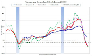
This graph compares the Composite 10 index to the Case-Shiller U.S. home price index. Note that the National price index is stair stepped because it is only available quarterly (and plotted monthly).
That extra few percent per year in the Composite 10 doesn't look like much, but it definitely added up!
Now to complicate the graph, lets add the Composite 20 (started in 2000) and the OFHEO Purchase Only home price indices. The larger the geographical coverage, the less the appreciation.
The OFHEO index lags the Case-Shiller index because it covers the entire nation (Case-Shiller is not really national), and OFHEO is probably also impacted by the use of conforming loans only.
The Q3 OFHEO index will be released tomorrow.


