by Calculated Risk on 5/25/2008 11:41:00 AM
Sunday, May 25, 2008
Existing Homes: Months of Supply vs. Real Prices
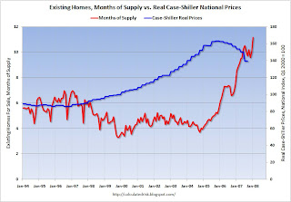
Here is a graph of existing home Months of Supply vs. quarterly Real Case-Shiller National house prices since Jan 1994. Click on graph for larger image.
A couple of notes: The Case-Shiller data is the National Index adjusted for inflation using CPI less shelter. The graph is monthly, but the Case-Shiller national data is quarterly (so the price data is stair-stepped). I only have monthly inventory and sales data back to Oct '93. Also, I'm missing some 2000 inventory data, and I extrapolated for a few months in 2000.
From this graph, it appears real prices are flat with about 6 months of inventory - prices rising with less than 6 months - and prices falling with more than 6 months. So perhaps we could argue house prices will fall until Months of Supply declines to close to 6 months.
However this relationship between price and Months of Supply doesn't seem to fit with earlier data. I have year end inventory and sales data back to 1982, and the following graph shows year end months of supply since 1982 (and April 2008). Year end inventory data is usually the low point for the year (as homeowners take their houses off the market for the holidays). So the months of supply was probably higher during the spring and summer selling months.
From Q1 1987 through Q3 1989, real national prices rose almost 10% according to the Case-Shiller National Index, even though year end Months of Supply was close to 7 months (and likely higher during the summer).
So maybe prices will flatten out when Months of Supply declines to 8 months or so.
With inventory levels approaching 12 months (11.2 months in the most recent report), prices will probably continue to fall for some time.


