by Calculated Risk on 5/04/2008 02:46:00 PM
Sunday, May 04, 2008
Housing Bust Duration: Update
Note: This is an update to a previous post using the February Case-Shiller Price Indices.
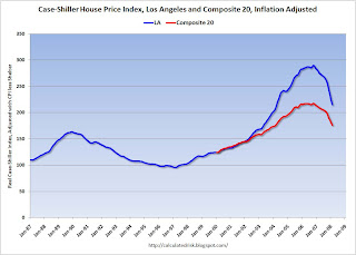
This first graph shows real Case-Shiller house prices for Los Angeles and the Composite 20 Index (20 large cities). The indices are adjusted with CPI less Shelter. Click on graph for larger image.
The most obvious feature is the size of the current housing price bubble compared to the late '80s housing bubble in Los Angeles.
The Composite 20 bubble looks similar (although larger) to the previous Los Angeles bubble. (Note the Composite 20 index started in 2000).
Perhaps we can overlay the current Composite 20 bubble on top of the previous Los Angeles bubble and learn something about the possible duration of the current bust.
In the second graph, the real price peaks are lined up for late '80s bubble in Los Angeles, and the current Composite 20 bubble. Note that the real price peak for the Composite 20 was flat for several months, so the real peak was chosen as May '06. It could also be a few months later. The peak and trough for the Los Angeles bubble are marked on the graph.
Prices are falling faster this time, probably because the bubble was larger.
It might be reasonable to expect that the dynamics of the current bust will be similar to the previous bust. After another year (or two) of rapidly falling prices, it's very likely that real prices will continue to fall - but at a slower pace. During the last few years of the bust, real prices will be flat or decline slowly - and the conventional wisdom will be that homes are a poor investment.
The Los Angeles bust took 86 months in real terms from peak to trough (about 7 years) using the Case-Shiller index. If the Composite 20 bust takes a similar amount of time, the real price bottom will happen in early 2013 or so. (But prices would be close in 2010).


