by Calculated Risk on 5/26/2008 05:12:00 PM
Monday, May 26, 2008
Scatter Graphs: Months of Supply vs. House Prices
The following two scatter plots compare existing home Months of Supply vs. the quarterly change (both nominal and real) in the Case-Shiller National Home Price index. (hat tip Langley Financial Planning blog for the idea)
Note: these graphs use data since Q1 1994. In prior periods, Months of Supply appeared to be higher with less negative impact on prices, see 2nd graph of Existing Homes: Months of Supply vs. Real Prices Click on graph for larger image.
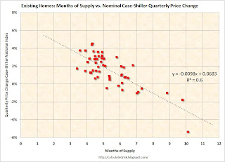
The first graph compares the Months of Supply and the quarterly change in the nominal Case-Shiller National Home Price index. The best linear fit has been added to the graph (plus the formula with an R2 of 0.6).
This is a limited amount of data (since Q1 1994), but this does suggest a relationship between price changes and Months of Supply (something we would normally expect). This suggests when there are more than 7 months of supply, nominal prices will decline (with some variability).
The average Months of Supply in Q1 2008 was just over 9.9 months, suggesting a nominal price decline of about 3.1% for Q1 (+/-2% or so). The Case-Shiller price index will be released on Tuesday. The second graph compares the Months of Supply and the quarterly change in the real (adjusted for inflation using CPI less shelter) Case-Shiller National Home Price index. The linear best fit is also added, and R2 is 0.54.
In real terms, prices start to decline when Months of Supply are greater than 6.3 months. This suggests the Case-Shiller index will decline about 3.4% in real terms in Q1 2008.
In April, the existing homes Months of Supply hit 11.2 months, and will probably be over 12 months this summer. This suggests nominal price declines of over 5% in Q2.


