by Calculated Risk on 7/26/2008 02:08:00 PM
Saturday, July 26, 2008
Graphs: Existing Home Sales
Here are some graphs (and analysis) based on the Existing Home sales report from the National Association of Realtors (NAR). (note: I was out of town this week, and couldn't post these earlier) Click on graph for larger image in new window.
The first graph shows existing home sales, on a Seasonally Adjusted Annual Rate (SAAR) basis since 1993.
Sales in June 2008 (4.86 million SAAR) were the weakest June since 1998 (4.78 million SAAR).
It's important to note that a large percentage of these sales were foreclosure resales (banks selling foreclosed properties). The NAR suggested that "short sales and foreclosures [account] for approximately one-third of transactions". Although these are real transactions, this means that normal activity (ex-foreclosures) is running around 3.3 million SAAR.
***************************** The second graph shows nationwide inventory for existing homes. According to NAR, inventory increased slightly to 4.49 million homes for sale in June. The typical pattern is for inventory to decline in December, and then to slowly rebound in January and February, and really start to increase from March through mid-Summer.
Some people are hoping that inventory is stabilizing at this level, however there is probably a significant "shadow inventory" waiting to come on the market.
Most REOs (bank owned properties) are including in the inventory because they are listed - but not all. Many houses in the foreclosure process are listed as short sales - so those would be counted too.
But there is some evidence lenders are holding off foreclosing, perhaps trying for workouts, or maybe the lenders are just overwhelmed - and many of these units are probably not included in inventory. And there are definitely homeowners waiting for a "better market" - and those homeowners will probably keep the supply high for a few years. The third graph shows the 'months of supply' metric for the last six years.
Months of supply increased to 11.1 months.
This follows the highest year end months of supply since 1982 (the all time record of 11.5 months of supply). Even if inventory levels stabilize, the months of supply could continue to rise - and possibly rise significantly - if sales decline later this year. I still expect to see 12 months of supply sometime later this year. The fourth graph shows Not Seasonally Adjusted (NSA) existing home sales for 2005 through 2008. Sales are sharply lower in June 2008 compared to the previous three years.
NSA sales were reported at 504 thousand in June, however about one-third of those were foreclosure resales. This means regular sales are less than half the level of June 2005 and 2006.
Note that June is an important month for existing home sales; existing home sales usually peak in the June through August period. This is usually about as good as it gets for sales on a NSA basis.
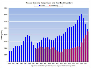
The next graph shows annual existing home sales and year end inventory. Note: for 2008 I used the June sales and inventory numbers. All other numbers are annual sales, and year-end inventory. If the red columns (inventory) rises above the blue column (sales) - something that is likely to happen this summer - then the "months of supply" number will be over 12.
The final graph shows the annual sales and year end inventory since 1982 (sales since 1969), normalized by the number of owner occupied units.
The graph shows that inventory is at an all time record level by this key measure. This also shows the annual variability in the turnover of existing homes, with a median of 6% of owner occupied units selling per year. Currently 6% of owner occupied units would be about 4.6 million existing home sales per year.
This indicates that the turnover of existing homes - June sales were at a 4.86 million Seasonally Adjusted Annual Rate (SAAR) - is still above the historical median. The reason sales are so high is because of all the foreclosure resales.
This suggests to me that sales will fall further later this year and in 2009.


