by Calculated Risk on 7/18/2008 11:24:00 AM
Friday, July 18, 2008
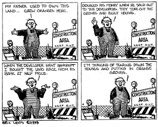
A Housing Cartoon from 1993
Haven't we been here before? Ah, yes ... Click on graph for larger image in new window.
This cartoon was drawn in 1993 by Eric G. Lewis, a freelance cartoonist living in Orange County, CA (used with permission).
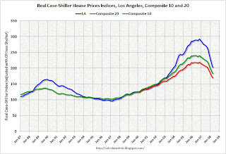
The following graph puts the cartoon into context. The graph compares real Case-Shiller house prices for Los Angeles and the Composite 10 and 20 Index (10 and 20 large cities). The indices are adjusted with CPI less Shelter.
Note that the cartoon was drawn in 1993 and real prices fell in the Los Angeles area for about four more years! The current Composite 20 bubble looks similar (although larger) to the previous Los Angeles bubble. (Note the Composite 20 index started in 2000). And prices will probably fall in real terms for several more years.
Professor Krugman presents a similar graph today using the Case-Shiller Composite 10 index and also looking at how elevated unemployment will probably linger. His conclusion: Housing slumps last.
Yes we've been here before - although this housing bubble was larger and more geographically pervasive than the earlier Los Angeles bubble.


