by Calculated Risk on 1/09/2009 10:38:00 PM
Friday, January 09, 2009
Office Investment
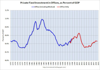
Just to put the coming office space bust in perspective, here are two graphs that show the amount of investment in office space in the U.S. Click on graph for larger image in new window.
The first graph shows the amount of office space delivered per year in the U.S. in millions of square feet since 1958. The over investment during the '80s (S&L crisis) is obvious, as is the office boom during the stock bubble.
The red columns are based on projections from Costar for projects already in the pipeline. The second graph shows office investment as a percent of GDP since 1972. Office investment increased slightly in Q3 2008 in nominal dollars, but decreased slightly as a percent of GDP.
NOTE: In 1997, the Bureau of Economic Analysis changed the office category. In the earlier years, offices included medical offices. After '97, medical offices were not included (The BEA presented the data both ways in '97).
Although I expect a significant decline in office investment over the next few years, the good news is the current boom wasn't anywhere near as large as the previous booms - so hopefully the bust will not be as bad as the early '90s.


