by Calculated Risk on 4/28/2009 11:22:00 AM
Tuesday, April 28, 2009
Case-Shiller: City Data
The following graph shows the price declines from the peak for each city included in S&P/Case-Shiller indices. In Phoenix, house prices have declined more than 50% from the peak. At the other end of the spectrum, prices in Charlotte and Dallas are off about 11% to 12% from the peak. Prices have declined by double digits everywhere.
Prices fell by 1% or more in most Case-Shiller cities in February, with Phoenix off 5.0% for the month alone.
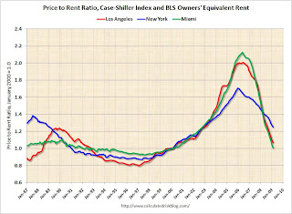
And here is the price-to-rent ratio for a few cities ... The second graph shows the price-to-rent ratio for Miami, Los Angeles and New York. This is similar to the national price-to-rent ratio, but uses local prices and local Owners' equivalent rent.
This ratio is getting close to normal for LA and Miami (Miami is back to the Jan 2000 ratio), but still has further to fall in NY.
Note: The Owners' Equivalent Rent (OER) is still increasing according to the BLS, however there are many reports of falling rents that isn't showing up yet in the OER.


