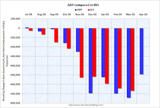
Several readers have sent me graphs showing that ADP and BLS employment numbers track pretty well over time. That is true - after revisions.
However I think in real time the ADP report isn't that useful for forecasting the BLS numbers (although it might offer a suggestion).
 Click on graph for larger image in new window.
This graph compares the ADP and BLS employment numbers (note: non-government) as originally released since last Summer.
Here is the original releases for ADP and for the BLS.
Although the two reports generally move together, there have been a number of significant misses; as examples: September, November and December of last year.
The consensus for BLS reported job losses is 630,000 (including government, to be announced Friday), and the ADP report suggests the losses might be a little lower.
However, initial weekly unemployment claims only declined slightly in April, and for the headline number (that includes government - not included in ADP) there have been a number of reports of local government layoffs.
John A. Challenger, chief executive officer of the placement company, said [this morning] ... “state and local governments, as well as school districts, are really feeling the impact of this downturn.”I think the job losses could be less than the average of the last 5 months (averaged 660 thousand per month), but not much less.