by Calculated Risk on 6/07/2009 12:13:00 PM
Sunday, June 07, 2009
Jobs and the Unemployment Rate
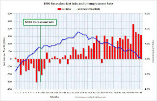
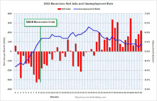
These four graphs show the monthly net job losses (and gains) and the unemployment rate for each of the last four recessions and recoveries.
Note: scales are not the same for all graphs, and the unemployment rate doesn't start at zero to better show the change.
 Click on graph for larger image in new window.
The first graph is for the 1981 recession.
Job losses abated, and the unemployment rate peaked, as the recession ended. This used to be the pattern for a recession as employers hired back employees immediately after the recession ended.
 The second graph is for the 1990 recession and shows the jobless recovery.
The unemployment rate continued to rise for 15 months (corrected) after the recession ended.
This is because the working age population continued to grow, so the unemployment rate increased even with no net job losses. Also discouraged workers usually start to return to the workforce as the economy recoveries - increasing the labor force too - and pushing up the unemployment rate if there are insufficient job gains. Note: the BLS only counts people actively seeking employment as part of the labor force.
 The third graph is for the 2001 recession.
 This is similar to the 1990 recession in that the unemployment rate continued to rise for 19 months (corrected) following the end of the recession.
However, following the 2001 recession, the labor market remained very weak with several months of substantial job losses. Also the participation rate declined sharply - suggesting a large number of discouraged workers.
 And the fourth graph is for the current recession.
It is very possible that the NBER will call the end of the recession before the job losses abate (like for the 1990 and 2001 recessions). And it also seems likely that the unemployment rate will continue to rise for the 18 months to 2 years or so since any recovery will probably be very sluggish.


