by Calculated Risk on 6/21/2009 07:32:00 PM
Sunday, June 21, 2009
LA, NY, San Francisco, Boston, Seattle, Detroit: Real Prices and the Unemployment Rate
Yesterday I posted a comparison of national real house prices and the unemployment rate. Today I'm posting the comparison for various cities.
Previous posts in this series:
National Real House prices and the unemployment rate.
Washington, D.C. real prices and unemployment.
Miami, Chicago, Dallas: Real House Prices and Unemployment Rate
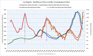
Notes: House prices are from Case-Shiller (back to 1987) and Freddie Mac's Purchase index (back to 1975). The Case-Shiller index was set equal to the Freddie Mac index in the first quarter Case-Shiller is available for each city, and then both indexes adjusted by CPI less shelter for each region.
The red unemployment rate is for each state and goes back to 1976. The orange unemployment line is for the metropolitan statistical areas (MSA) (most go back to 1990)
Note the scale of unemployment rate doesn't start at zero (to better compare to house prices) and scales are different for each city. Click on image for larger graph in new window.
The first graph is for Los Angeles and shows the well known late '80s housing bubble.
There was a much smaller price bubble in the late '70s.
This is a good example of house prices still falling in real terms after a housing bubble, until sometime after the unemployment rate peaks. The second graph is for San Francisco.
San Francisco had a similar bubble as LA. The purple lines show the peaks in the unemployment rate after a house price bubble.
And the third graph is for New York. New York had a bubble in the late '80s too.
And just like in LA and SF, real house prices continued to fall even after the unemployment rate peaked.
New York didn't have a bubble in the late '70s. The fourth graph is for Boston.
Boston had a serious housing bubble in the mid-to-late '80s - in some ways this was the worst of the late '80s housing bubbles.
Once again (sorry no line), real prices continued to drift downwards for a few years after the post-bubble unemployment rate had peaked in the '90s. The fifth graph is for Seattle.
Seattle has a changing economy - back in the '70s it was driven by the fortunes of Boeing, but by the '90s, it was more Microsoft and other tech companies and that shift probably kept house prices from falling in the early '90s.
For the late '70s bubble, we see house prices fell until the unemployment rate peaked (see dashed purple line). And finally Detroit (note the price index is on a different scale).
Detroit had a mini-bubble in the late '70s, and once again real prices fell, until the post bubble unemployment rate peaked.
Although there are many other factors influencing house prices, I expect real house prices to decline until the unemployment rate peaks - and maybe even decline slightly (in real terms) for a few more years.


