by Calculated Risk on 6/21/2009 03:42:00 PM
Sunday, June 21, 2009
Miami, Chicago, Dallas: Real House Prices and Unemployment Rate
Yesterday I posted a comparison of national real house prices and the unemployment rate. Today I'm posting the comparison for various cities.
Previous posts:
National Real House prices and the unemployment rate.
Washington, D.C. real prices and unemployment.
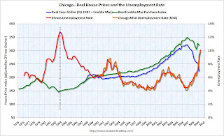
Notes: House prices are from Case-Shiller (back to 1987 for Miami and Chicago, and 2000 for Dallas) and Freddie Mac's Purchase index (back to 1975). The Case-Shiller index was set equal to the Freddie Mac index in Q1 1987 (Q 2000 for Dallas), and then both indexes adjusted by CPI less shelter for South Urban cities (Chicago used Midwest urban cities).
The red unemployment rate is for the states and only goes back to 1976. The orange unemployment line is for the metropolitan statistical areas (MSA)
Note the scale of unemployment rate doesn't start at zero (to better compare to house prices). Click on image for larger graph in new window.
In Miami, real house prices increased in the last '70s, but those increases were dwarfed by the current bubble.
Miami doesn't have a good example of a previous bubble to compare falling house prices and the unemployment rate.
Maybe if we had data back to the great Florida housing bubble of the 1920s! The second graph is for Chicago.
Chicago has an example of a previous housing bubble in the late '70s. And house prices fell basically until the unemployment rate peaked (see dashed purple line).
And the third graph is for Dallas.
Dallas had a housing price bubble in the early '80s because of high oil prices during that period. House prices and the unemployment rate appear unrelated, and we would probably have to look at net migration to understand why prices fell.
The pattern I expect is for house prices to fall (after a bubble) until the unemployment rate peaks - and possibly for some time after the unemployment rate peaks.
Some serious bubble cities to come ...


