by Calculated Risk on 7/17/2009 04:00:00 PM
Friday, July 17, 2009
Market, State Unemployment, Fed Balance Sheet
A few graphs ... Click on graph for larger image in new window.
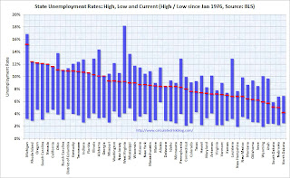
The first graph shows the high and low unemployment rates for each state (and D.C.) since 1976. The red bar is the current unemployment rate (sorted by the current unemployment rate).
Sixteen states now have double digit unemployment rates.
Missouri, Washington, New Jersey and West Virginia are getting close.
Eight states are at record unemployment rates: Rhode Island, Oregon, South Carolina, Nevada, California, Florida, Georgia, and Delaware. The Atlanta Fed is now posting Economic Highlights and Financial Highlights weekly.
I cover most of the economic data as it is released, but these are good summaries.
This graph shows the composition of the Fed's assets. From the Atlanta Fed:
While the overall size of the Fed’s balance sheet has been shrinking slightly over the last two months, the composition of the balance sheet has changed. There have been sizeable declines in short-term lending to financials and lending to nonbank credit markets. For example, combined, TAF credit, currency swaps, and the CPFF have fallen by about one-half from over $1 trillion on April 8 to just under $500 billion on July 8. Offsetting these declines have been increases in holdings of agency debt, agency mortgage backed securities (MBS), and U.S. Treasury securities. Combined, these three categories have increased by about $430 billion since April 8.
This graph is from Doug Short of dshort.com (financial planner): "Four Bad Bears".
Note that the Great Depression crash is based on the DOW; the three others are for the S&P 500.


