Last month I showed data on trends in the REO inventories of Fannie, Freddie, and FHA, highlighting how while total REO inventory estimates appear to have fallen, REO at “the F’s” has increased notably over the last year. A few folks questioned how there could be reports of sharply lower REO inventories in many parts of the country if the F’s REO’s were up so much.
 Click on graph for larger image in new window.
Well, the answer mainly in REO inventories in the “non-agency” space, and especially REO inventories held by trusts for private-label mortgage-backed securities. Here is a chart (courtesy of Amherst) showing REO inventories for private-label securities tracked by LoanPerformance, which folks estimate accounts for about 85-90% of the private-label market.
As the above chart indicates, REO inventory from private-label MBS (where mortgage credit performance started to deteriorate sharply well before the ‘prime” market began to deteriorate in a big way) increased at a rapid clip from end of 2007 through the fall of 2008, peaking in October. It then began to decline as servicers accelerated the pace of REO sales last winter and early Spring, often by slashing prices – thus resulting in the “de-stickification” of home prices observed this cycle relative to past cycles.
 Contrast that with REO inventories at Fannie, Freddie, and FHA.
 Most areas where one hears that REO inventories have plunged over the last year are in areas that had a high share of “risky” mortgages and a disproportionately high share of loans that were packaged into private-label securities.
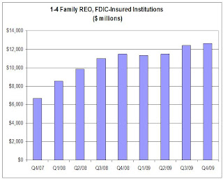
On the depository institution front, data on the book value of FDIC-insured institutions’ holdings of 1-4 family REO – in $’s, but not units – is shown below.
 Before discussing the chart, it should be noted that when a financial institution acquires the title to a property through foreclosure, the REO is supposed to be accounted for at fair value less costs to sell. This amount, of course, is often a boatload less than the mortgage balance at the time of foreclosure. Unfortunately, I don’t yet have any hard data on the average carrying cost of REO.
Second, over the last few years the % of mortgages held by banks and thrifts that are FDIC insured has increased. E.g., according to Fed data vs. FDIC data, the ratio of 1-4 family mortgages held by FDIC-insured institutions to 1-4 family mortgages held by all bank and savings institutions went from 89.3% at the end of 2007 to 92.9% at the end of 2009 – implying that the above chart for REO trends overstates a tad the increase in all banks and thrifts.
Having said that, it’s pretty clear that REO inventories at depositories grew at a decent clip (though much slower than REO at PLS) from the end of 2007 to the end of 2008, went down a “scooch” in the first half of 2009 (mainly, I believe, reflecting certain foreclosure moratoria), and then increased a bit in the second half of last year – though less rapidly than at the GSEs.
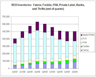
 Putting the Fannie, Freddie, FHA, and private-label data (with the latter “grossed up” assuming LP covers 85% of the market) together; making a crude assumption of units of REO at banks and thrifts (and grossing the total up to reflect non-FDIC institutions), here is a crude look at the path of REO inventories by quarter from the end of 2007 through the end of 2009. These estimates would NOT be the full market, of course, but the general pattern would probably reflect the overall market.
Note that this is still a “work in progress, and some of the assumptions I’ve made on depositories could be wrong. However, for those who wondered “how could REO have fallen so much if REO at ‘the F’s’ had gone up so much,” here is your answer. Once you factor in the private label market, it is not so “F’ing” hard to understand.
CR Note: The post was from economist Tom Lawler.