by Calculated Risk on 11/06/2010 02:15:00 PM
Saturday, November 06, 2010
Employment: Participation Rate
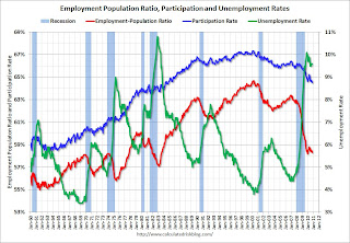
The following graph shows the employment population ratio, the participation rate, and the unemployment rate (ht Dirk).
 Click on graph for larger image.
Most of the increase in the participation rate in the '60 and '70s was from women joining the labor force. However one of the key features of the current employment recession is the decline in the participation rate.
The sharplest declines in the participation rate are for the "16 to 19" and the "20 to 24" age groups.
The partcipation rate for the "16 to 19" group has fallen from 41.4% in Dec 2007 to 35.2% in Oct 2010.
The participation rate for the "20 to 24" group has fallen from 74.0% to 71.4% in the same period.
The participation rate for the "55 and over" group has increased from 38.9% to 40.0% since December 2007. Of course the size of the "55 and over" group is increasing, and that might be pushing down the overall participation rate. I'll have more on this later this week.
 And a repeat of a popular graph ...
The second graph shows the job losses from the start of the employment recession, in percentage terms (as opposed to the number of jobs lost).
The dotted line is ex-Census hiring. The two lines have joined since the decennial Census is over.
Best to all


