by Calculated Risk on 5/06/2011 01:25:00 PM
Friday, May 06, 2011
Employment: A dirty little secret and more graphs
First, anyone who adds (or subtracts) the Not Seasonally Adjusted (NSA) birth/death model numbers from the headline SA payroll employment is clueless. Someone sent me this "analysis" today: "... you exclude the 62K from McDonalds hirings, and 175K from the Birth Death Adjustment, and end up with.... +7K jobs". That is complete nonsense. The key issue with the birth/death model is it misses turning points; otherwise it is an important part of the monthly estimate.
Second, I was reminded of a "dirty little secret" when I read Paul Krugman's column this morning. Krugman wrote about how the "D.C. economic discourse is saturated with fear" of "invisible monsters", but that no one seems to care about the very real plight of the millions of unemployed.
Actually it really isn't much of a secret that Wall Street and corporate America like the unemployment rate to be a little high. But it is "dirty" in the sense that it is unspoken. Higher unemployment keeps wage growth down, and helps with margins and earnings - and higher unemployment also keeps the Fed on the sidelines. Yes, corporations like to see job growth, so people have enough confidence to spend (and they can have a few more customers). And they definitely don't want to see Depression era unemployment - but a slowly declining unemployment rate (even at 9%) with some job growth is considered OK.
I just want to be clear: I don't think 9% unemployment is OK. It is pretty $%^# far from OK. (think Marsellus Wallace in "Pulp Fiction" for my non-G rated reaction). I'm amazed that unemployment isn't the key topic in D.C., but the unemployed don't make political contributions. (Ok, enough rant).
Here are a few more graphs based on the employment report ...
 Click on graph for larger image in graph gallery.
This graph shows the duration of unemployment as a percent of the civilian labor force. The graph shows the number of unemployed in four categories: less than 5 week, 6 to 14 weeks, 15 to 26 weeks, and 27 weeks or more.
In general, all four categories are trending down, althoug the "less than 5 weeks" category increased this month. Note that the "less than 5 weeks" used to be much higher, even during periods of strong job growth. This is probably because of a change in hiring practices that resulted in less turnover.
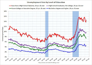
 This graph shows the unemployment rate by four levels of education (all groups are 25 years and older).
Unfortunately this data only goes back to 1992 and only includes one previous recession (the stock / tech bust in 2001). Clearly education matters with regards to the unemployment rate - and it appears all four groups are generally trending down, although all categories saw an increase in April.
 This is a little more technical. The BLS diffusion index for total private employment was at 64.6 in April, and for manufacturing, the diffusion index increased to 65.4.
 Think of this as a measure of how widespread job gains are across industries. The further from 50 (above or below), the more widespread the job losses or gains reported by the BLS. From the BLS:
Figures are the percent of industries with employment increasing plus one-half of the industries with unchanged employment, where 50 percent indicates an equal balance between industries with increasing and decreasing employment.The level of both indexes was a clear positive in the April employment report.
What we want is a large number of high paying jobs added each month, spread across many industries. What we got was some improvement in jobs added, although not high paying jobs - but fairly widespread.
Best to all
Here are the earlier employment posts (with graphs):
• April Employment Report: 244,000 Jobs, 9.0% Unemployment Rate
• Employment Summary, Part Time Workers, and Unemployed over 26 Weeks
• Employment Graph Gallery


