by Calculated Risk on 10/07/2011 01:03:00 PM
Friday, October 07, 2011
Duration of Unemployment, Unemployment by Education and Diffusion Indexes
Here are the earlier employment posts (with graphs):
• September Employment Report: 103,000 Jobs, 9.1% Unemployment Rate
• Employment Summary, Part Time Workers, and Unemployed over 26 Weeks
• Employment graph gallery
And a few more graphs based on the employment report:
 This graph shows the duration of unemployment as a percent of the civilian labor force. The graph shows the number of unemployed in four categories: less than 5 week, 6 to 14 weeks, 15 to 26 weeks, and 27 weeks or more.
Two categories increased in August: The 27 weeks and more (the long term unemployed) increased to 6.242 million workers, or just over 4.0% of the labor force, and the less than '5 weeks' category increased slightly - this followed the recent increase in initial weekly unemployment claims.
The other two categories decreased. The decrease in the '15 to 26 weeks' group is probably from workers moving into the 27 weeks and more category.
The key point is the that number (and percent) of long term unemployed remains very high.
 This graph shows the unemployment rate by four levels of education (all groups are 25 years and older).
Unfortunately this data only goes back to 1992 and only includes one previous recession (the stock / tech bust in 2001). Clearly education matters with regards to the unemployment rate - and it appears all four groups are generally trending down.
Although education matters for the unemployment rate, it doesn't appear to matter as far as finding new employment (all four categories are only gradually declining).
Note: This says nothing about the quality of job - as an example, a college graduate working at minimum wage would be considered "employed".
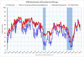
 This is a little more technical. The BLS diffusion index for total private employment was at 55.4 in September, down slightly from 55.6 in August, and for manufacturing, the diffusion index decreased to 46.3 - the 2nd consecutive reading under 50.
 Think of this as a measure of how widespread job gains are across industries. The further from 50 (above or below), the more widespread the job losses or gains reported by the BLS. From the BLS:
Figures are the percent of industries with employment increasing plus one-half of the industries with unchanged employment, where 50 percent indicates an equal balance between industries with increasing and decreasing employment.This was the lowest diffusion index for total private employment since May, and the lowest for manufacturing since October 2010.
We'd like to see the diffusion indexes consistently above 60 - and even in the 70s like in the '1990s.


