by Calculated Risk on 12/08/2011 04:38:00 PM
Thursday, December 08, 2011
Labor Force Participation Rate: The Kids are Alright
On Sunday I posted Comments on the Employment-Population Ratio with a follow up yesterday: Labor Force Participation Rate by Age Group
Some people have wondered why the participation rate has been declining for the younger age groups.
First below is a repeat of the graph from yesterday showing the trends by age group since 1990.
Note: The participation rate is the percentage of the working age population in the labor force.
 Click on graph for larger image.
Some of the recent decline in the participation rate for the '20 to 24' age group is probably related to the recession.
But probably the main reason for the decline in the participation rate for the younger age groups is that more people are pursuing higher education. (ht Rick Nevin) Nevin writes:
The decline in age-16-19 and age-20-24 labor force participation is the mirror image of the increase in school enrollment rates for those age groups. This trend is exactly what was anticipated by (promised by) research that supported the phase-out of lead in gasoline from the early-1970s through the mid-1980s, and subsequent lead paint hazard reduction requirements, including my 1999 Economic Analysis of HUD lead hazard reduction requirements.Note: I do not know Rick Nevin, but I have read some research about the link between lead and crime (and IQ). As an example, from Professor Jessica Wolpaw Reyes: Environmental Policy as Social Policy? The Impact of Childhood Lead Exposure on Crime makes a strong argument that removing lead from gasoline from 1975 to 1985 led to lower crime rates.
More from Nevin:
The decline in labor force participation for ages 16-24 might be partly due to a short term “bad news” story about discouraged workers, but it is mainly due to a longer term “great news” story about ongoing gains in school enrollment and academic attainment.
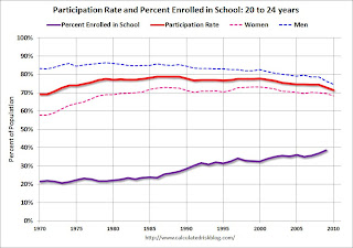
 This graph uses data from the BLS on participation rate, and the National Center for Education Statistics (NCES) on enrollment rates.
This graph shows the participation and enrollment rates for the 18 to 19 year old age group. These two lines are a "mirror image".
Note: I added the participation rate for men and women too. One of the key labor stories in the 2nd half of the 1900s was the surge in participation by women.
 The third graph shows the participation and enrollment rates for the 20 to 24 year old age group.
Once again the participation rate is declining as the enrollment rate is increasing. The participation rate (all) was rising in the '70s and early '80s because of the increase in women entering the labor force.
In the long run, more education is a positive for the economy (although I am concerned about the surge in student loans). This increase in education enrollment suggests we should look at the prime working age (25 to 54) for changes in the participation rate and employment-population ratio due to the recent recession.
But mostly it suggests that the kids are alright!


