by Calculated Risk on 3/10/2012 08:01:00 PM
Saturday, March 10, 2012
Construction Employment, Duration of Unemployment, Unemployment by Education and Diffusion Indexes
A few more graphs based on the February employment report. The first graph below shows the number of total construction payroll jobs in the U.S. including both residential and non-residential since 1969.
Construction employment decreased by 13 thousand jobs in February, but construction employment has increased 98 thousand since bottoming in January 2011. Last year was the first year with an increase in construction employment since 2006, and the first with an increase in residential construction employment since 2005.
Unfortunately this graph is a combination of both residential and non-residential construction employment. The BLS only started breaking out residential construction employment fairly recently (residential specialty trade contractors in 2001).
Usually residential investment (and residential construction) leads the economy out of recession, and non-residential construction usually lags the economy. Because this graph is a blend, it masks the usual pickup in residential construction following previous recessions. Of course residential construction didn't lead the economy this time because of the large excess supply of vacant homes.
 Click on graph for larger image.
Construction employment is generally increasing and construction will add to both GDP and employment growth in 2012.
As I've noted for years, there are usually two bottoms for housing following a bubble: 1) when housing starts, new home sales, and residential construction bottoms, and 2) when house prices bottom. It is pretty clear that the bottom is in for housing starts, new home sales and construction employment, and I think we are very close on prices.
 This graph shows the duration of unemployment as a percent of the civilian labor force. The graph shows the number of unemployed in four categories: less than 5 week, 6 to 14 weeks, 15 to 26 weeks, and 27 weeks or more.
All categories are moving down (the less than 5 week category is back to normal levels). The other categories are still high.
The the long term unemployed declined to 3.5% of the labor force - this is still very high, but the lowest since August 2009.
 This graph shows the unemployment rate by four levels of education (all groups are 25 years and older).
Unfortunately this data only goes back to 1992 and only includes one previous recession (the stock / tech bust in 2001). Clearly education matters with regards to the unemployment rate - and it appears all four groups are generally trending down.
Note: This says nothing about the quality of jobs - as an example, a college graduate working at minimum wage would be considered "employed".
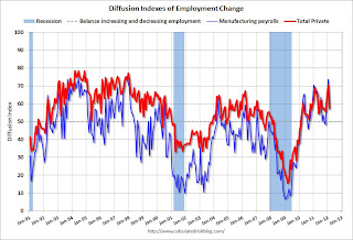
 This is a little more technical. The BLS diffusion index for total private employment was at 57.9 in February and for manufacturing, the diffusion index was at 56.8. The index was revised up sharply for January - to the highest level since the '90s.
Think of this as a measure of how widespread job gains are across industries. The further from 50 (above or below), the more widespread the job losses or gains reported by the BLS. From the BLS:
Figures are the percent of industries with employment increasing plus one-half of the industries with unchanged employment, where 50 percent indicates an equal balance between industries with increasing and decreasing employment.It appears job growth is now fairly widespread across industries.
Earlier:
• Summary for Week ending March 9th
• Schedule for Week of March 11th
Employment posts yesterday:
• February Employment Report: 227,000 Jobs, 8.3% Unemployment Rate
• Employment Summary and Discussion
• All Employment Graphs
• An older post: Percent Job Losses: Great Recession and Great Depression


