by Calculated Risk on 11/10/2012 08:05:00 AM
Saturday, November 10, 2012
Summary for Week Ending Nov 9th
The big event this week was the presidential election. For economic data, this was a pretty light week.
The key report was the trade deficit that showed exports increased more than imports in September, and the trade deficit declined. Also Consumer sentiment has increased to pre-recession levels.
Other data was a little weak: The ISM service index declined in October, and job openings declined in September.
Next week will be busier.
Here is a summary of last week in graphs:
• Trade Deficit declined in September to $41.5 Billion
 Click on graph for larger image.
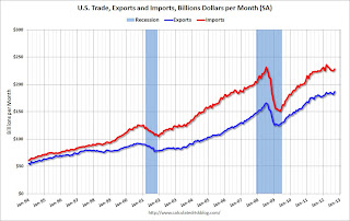
The first graph shows the monthly U.S. exports and imports in dollars through September 2012.
Both exports and imports increased in September. Exports are at a new high. The trade deficit was smaller than the consensus forecast of $45.4 billion.
Exports are 13% above the pre-recession peak and up 3.5% compared to September 2011; imports are 1% below the pre-recession peak, and up about 1.5% compared to September 2011.
 The second graph shows the U.S. trade deficit, with and without petroleum, through September.
The blue line is the total deficit, and the black line is the petroleum deficit, and the red line is the trade deficit ex-petroleum products.
Oil averaged $98.88 in September, up from $94.36 per barrel in August. The trade deficit with China increased to $29.1 billion in September, up from $28.0 billion in September 2011. Most of the trade deficit is due to oil and China.
This suggests a small upward revision to Q3 GDP.
• ISM Non-Manufacturing Index decreases in October
 The October ISM Non-manufacturing index was at 54.2%, down from 55.1% in September. The employment index increased in October to 54.9%, up from 51.1% in September. Note: Above 50 indicates expansion, below 50 contraction.
This graph shows the ISM non-manufacturing index (started in January 2008) and the ISM non-manufacturing employment diffusion index.
This was below the consensus forecast of 54.9% and indicates slower expansion in October than in September. The internals were mixed with the employment index up, but new orders down.
• BLS: Job Openings "essentially unchanged" in September, Up year-over-year
 This graph shows job openings (yellow line), hires (dark blue), Layoff, Discharges and other (red column), and Quits (light blue column) from the JOLTS.
Notice that hires (dark blue) and total separations (red and light blue columns stacked) are pretty close each month. This is a measure of turnover. When the blue line is above the two stacked columns, the economy is adding net jobs - when it is below the columns, the economy is losing jobs.
Jobs openings decreased in September to 3.561 million, down slightly from 3.661 million in August. The number of job openings (yellow) has generally been trending up, and openings are only up about 2% year-over-year compared to September 2011.
Quits decreased in September, and quits are down slightly year-over-year. These are voluntary separations. (see light blue columns at bottom of graph for trend for "quits").
• Weekly Initial Unemployment Claims decline to 355,000
 The DOL reported: "In the week ending November 3, the advance figure for seasonally adjusted initial claims was 355,000, a decrease of 8,000 from the previous week's unrevised figure of 363,000. The 4-week moving average was 370,500, an increase of 3,250 from the previous week's unrevised average of 367,250."
The dashed line on the graph is the current 4-week average. The four-week average of weekly unemployment claims increased to 370,500. This is about 7,000 above the cycle low for the 4-week average of 363,000 in March.
Mostly moving sideways this year, but near the cycle bottom.
SPECIAL NOTE: Due to Hurricane Sandy, we will probably see an increase in initial unemployment claims over the next few weeks. The decline this week was probably because some people in a few states - like New York and New Jersey - were not able to file claims immediately.
• Fannie, Freddie, FHA REO inventory declined in Q3
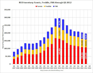
 This graph shows the REO inventory for Fannie, Freddie and the FHA (FHA for August). This was the seventh straight quarterly decline in the "F's" REO inventory, and total "F" REO was down 12% from a year ago.
 This is only a portion of the total REO. There is also REO for private-label MBS, FDIC-insured institutions, VA and more. REO has been declining for those categories too.
The second graph shows the same data with Private Label Securities added.
 From Tom Lawler:
 Here is a chart showing some history of SF REO holdings of Fannie, Freddie, FHA, and private-label securities (from Barclays Capital). Note that FHA has not yet released its report to the FHA commissioner for September (everything there may be focused on the FY 2012 Actuarial Review due out next week, which could be a doozy!), and the number for the end of Q3/2012 (38,187) is actually the August inventory number.
More from CR: When the FDIC's Q3 quarterly banking profile is released in a couple of weeks, I'm sure Tom will add an estimate for REO at FDIC-insured institutions. This is not all REO: In addition to the FDIC-insured institution REO, this excludes non-FHA government REO (VA, USDA, etc.), credit unions, finance companies, non-FDIC-insured banks and thrifts, and a few other categories.
• Preliminary November Consumer Sentiment increases to 84.9
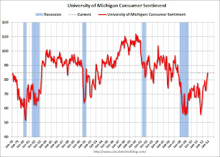
 The preliminary Reuters / University of Michigan consumer sentiment index for November increased to 84.9 from the October reading of 82.6. This was the highest level since July 2007 - before the recession started.
This was above the consensus forecast of 83.1. Overall sentiment is still somewhat weak - probably due to a combination of the high unemployment rate and the sluggish economy - but consumer sentiment has been improving recently.
However - remember - that sharp decline in sentiment in August 2011 was due to the threat of default and the debt ceiling debate. Hopefully we will not see that again early next year before the fiscal slope is resolved.


