• Housing Starts decreased to 890 thousand SAAR in January, Single Family Starts Increased
 Click on graph for larger image.
From the Census Bureau: "Privately-owned housing starts in January were at a seasonally adjusted annual rate of 890,000. This is 8.5 percent below the revised December estimate of 973,000, but is 23.6 percent above the January 2012 rate of 720,000.
Single-family housing starts in January were at a rate of 613,000; this is 0.8 percent above the revised December figure of 608,000. The January rate for units in buildings with five units or more was 260,000."
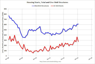
The first graph shows single and multi-family housing starts for the last several years.
Multi-family starts (red, 2+ units) decreased sharply in January.
Single-family starts (blue) increased to 613,000 thousand in January and are at the highest level since 2008.
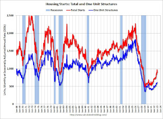
The second graph shows total and single unit starts since 1968.
 This shows the huge collapse following the housing bubble, and that housing starts have been increasing lately after moving sideways for about two years and a half years.
 Total starts are up about 86% from the bottom start rate, and single family starts are up about 74 percent from the post-bubble low.
This was below expectations of 914 thousand starts in January due to the sharp decrease in the volatile multi-family sector. Starts in January were up 23.6% from January 2012.
• Existing Home Sales in January: 4.92 million SAAR, 4.2 months of supply
The NAR reported: January Existing-Home Sales Hold with Steady Price Gains, Seller’s Market Developing
 This graph shows existing home sales, on a Seasonally Adjusted Annual Rate (SAAR) basis since 1993.
 Sales in January 2013 (4.92 million SAAR) were 0.4% higher than last month, and were 9.1% above the January 2012 rate.
According to the NAR, inventory declined to 1.74 million in January down from 1.83 million in December. This is the lowest level of inventory since December 1999. Inventory is not seasonally adjusted, and usually inventory decreases from the seasonal high in mid-summer to the seasonal lows in December and January.
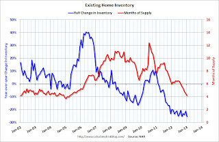
The next graph shows the year-over-year (YoY) change in reported existing home inventory and months-of-supply. Since inventory is not seasonally adjusted, it really helps to look at the YoY change. Note: Months-of-supply is based on the seasonally adjusted sales and not seasonally adjusted inventory.
 Inventory decreased 25.3% year-over-year in January from January 2012. This is the 23rd consecutive month with a YoY decrease in inventory.
Months of supply declined to 4.2 months in January, the lowest level since April 2005.
This was at expectations of sales of 4.94 million. For existing home sales, the key number is inventory - and the sharp year-over-year decline in inventory is a positive for housing.
• MBA: "Mortgage Delinquency and Foreclosure Rates Finished 2012 Down Sharply"
From the MBA: Mortgage Delinquency and Foreclosure Rates Finished 2012 Down Sharply
 This graph shows the percent of loans delinquent by days past due.
Loans 30 days delinquent decreased to 3.04% from 3.25% in Q3. This is just below 2007 levels and around the long term average.
Delinquent loans in the 60 day bucket decreased to 1.16% in Q4, from 1.19% in Q3.
The 90 day bucket decreased to 2.89% from 2.96%. This is still way above normal (around 0.8% would be normal according to the MBA).
The percent of loans in the foreclosure process decreased to 3.74% from 4.07% and is now at the lowest level since 2008.
 This graph is from the MBA and shows the percent of loans in the foreclosure process by state. Posted with permission.
The top states are Florida (12.15% in foreclosure down from 13.04% in Q3), New Jersey (8.85% down from 8.87%), New York (6.34% down from 6.46%), Illinois (6.33% down from 6.83%), and Nevada (the only non-judicial state in the top 13 at 5.87% down from 5.93%).
As Fratantoni noted, California (2.06% down from 2.63%) and Arizona (2.02% down from 2.51%) are now well below the national average by every measure.
• Key Measures show low inflation in January
 This graph shows the year-over-year change for four key measures of inflation: trimmed-mean CPI, median CPI, CPI less food and energy, and core PCE prices. On a year-over-year basis, the median CPI rose 2.1%, the trimmed-mean CPI rose 1.9%, and the CPI less food and energy rose 1.9%. Core PCE is for December and increased 1.4% year-over-year.
On a monthly basis, median CPI was at 2.6% annualized, trimmed-mean CPI was at 2.2% annualized, and core CPI increased 3.1% annualized. Also core PCE for December increased 0.2% annualized.
The inflation report for February will be released on March 15th, a few days before the next Fed meeting. But with this low level of inflation and the current high level of unemployment, I expect the Fed will keep the "pedal to the metal" at the meeting of March 19th and 20th.
• Weekly Initial Unemployment Claims increased to 362,000
 The DOL reports:
In the week ending February 16, the advance figure for seasonally adjusted initial claims was 362,000, an increase of 20,000 from the previous week's revised figure of 342,000. The 4-week moving average was 360,750, an increase of 8,000 from the previous week's revised average of 352,750.The dashed line on the graph is the current 4-week average. The four-week average of weekly unemployment claims increased to 360,750 - the highest 4-week average since the first week of January.
Weekly claims were above the 359,000 consensus forecast.
• AIA: "Strong Surge for Architecture Billings Index"
Note: This index is a leading indicator primarily for new Commercial Real Estate (CRE) investment.
 From AIA: Strong Surge for Architecture Billings Index
 This graph shows the Architecture Billings Index since 1996. The index was at 54.2 in January, up from 51.2 in December. Anything above 50 indicates expansion in demand for architects' services.
Every building sector is now expanding and new project inquiries are strongly positive. Note: This includes commercial and industrial facilities like hotels and office buildings, multi-family residential, as well as schools, hospitals and other institutions.
According to the AIA, there is an "approximate nine to twelve month lag time between architecture billings and construction spending" on non-residential construction. This suggests some increase in CRE investment in 2013.