by Calculated Risk on 3/03/2013 10:34:00 AM
Sunday, March 03, 2013
Housing: The Two Bottoms
Last year when I wrote The Housing Bottom is Here and Housing: The Two Bottoms, I pointed out there are usually two bottoms for housing: the first for new home sales, housing starts and residential investment, and the second bottom is for house prices.
For the bottom in activity, I presented a graph of Single family housing starts, New Home Sales, and Residential Investment (RI) as a percent of GDP.
When I posted that graph, the bottom wasn't obvious to everyone. Now it is, and here is another update to that graph.
 Click on graph for larger image.
The arrows point to some of the earlier peaks and troughs for these three measures.
The purpose of this graph is to show that these three indicators generally reach peaks and troughs together. Note that Residential Investment is quarterly and single-family starts and new home sales are monthly.
For the current housing bust, the bottom was spread over a few years from 2009 into 2011. This was a long flat bottom - something a number of us predicted given the overhang of existing vacant housing units.
We could use any of these three measures to determine the first bottom, and then use the other two to confirm the bottom. But this says nothing about prices.
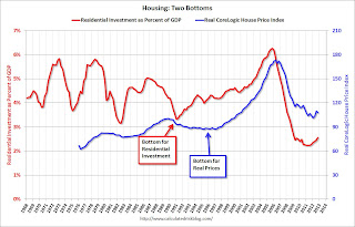
 The second graph compares RI as a percent of GDP with the real (adjusted for inflation) CoreLogic house price index through December.
Although the CoreLogic data only goes back to 1976, look at what happened following the early '90s housing bust. RI as a percent of GDP bottomed in Q1 1991, but real house prices didn't bottom until Q4 1996 (real prices were mostly flat for several year). Something similar happened in the early 1980s - first activity bottomed, and then real prices - although the two bottoms were closer in the '80s.
Now it appears activity bottomed in 2009 through 2011 (depending on the measure) and house prices bottomed in early 2012.


