by Calculated Risk on 4/09/2013 05:32:00 PM
Tuesday, April 09, 2013
Job Openings and Nonfarm Payrolls
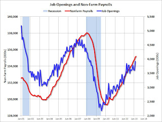
Reader Picosec suggests "An interesting graph would be a time series showing both Job Openings and Change in Payroll Jobs. [This] might indicate whether one was predictive of the other, and to what extent."
Sometimes I do requests ... Unfortunately the JOLTS time series for job openings is very limited (released for February this morning) and only has data back to December 2000.
We always have to be extra careful with limited data.
The following graph shows non-farm payroll (left axis) and job openings (right axis).
 Click on graph for larger image in graph gallery.
In general the two series move together, although it appears job openings leads non-farm payroll at turning points. However the JOLTS is a noisy series, so we might not be able to tell at turning points - but if job openings turned down over several months, I'd be concerned about payrolls. Right now job openings are at the highest level since May 2008.


