by Calculated Risk on 5/03/2013 03:24:00 PM
Friday, May 03, 2013
Update: The Future's so Bright ...
Back in January I wrote: The Future's so Bright .... I started by writing that "It looks like economic growth will pickup over the next few years", although for 2013, I was expecting "another year of sluggish growth" due to fiscal policy.
I also argued that the "key short term risk is too much additional deficit reduction too quickly". Unfortunately I was expecting some sort of agreement to delay or reduce the sequester budget cuts - so there will be more fiscal drag this year than I expected - but I still think the future is bright.
The following is an update to the graphs and text in the earlier post:
 Click on graph for larger image.
This graph shows total and single family housing starts through March 2013. Even after the 28.2% in 2012, the 781 thousand housing starts in 2012 were the fourth lowest on an annual basis since the Census Bureau started tracking starts in 1959. Starts averaged 1.5 million per year from 1959 through 2000. Demographics and household formation suggests starts will return to close to that level over the next few years. That means starts will come close to doubling from the 2012 level.
Residential investment and housing starts are usually the best leading indicator for economy, so this suggests the economy will continue to grow over the next couple of years.
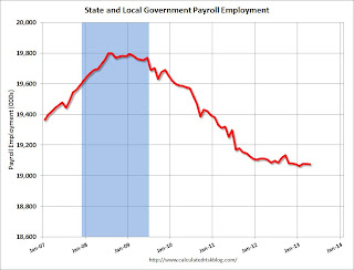
 The second graph shows total state and government payroll employment since January 2007. State and local governments lost 129,000 jobs in 2009, 262,000 in 2010, and 239,000 in 2011, and 34,000 jobs in 2012. So far in 2013, state and local government employment is unchanged.
It appears most of the state and local government layoffs are over. Some states, like California, are now running a budget surplus, so the layoffs will probably end.
Note: Federal employment is still declining.
 Here is a key graph on the US deficit. As we've been discussing, the US deficit as a percent of GDP has been declining, and will probably decline to under 3% in fiscal 2015 with no additional policy changes (there are still long term issues).
This graph shows the actual (purple) budget deficit each year as a percent of GDP, and an estimate for the next ten years based on estimates from the CBO.
Note: With 7.5% unemployment, there is a strong argument for less deficit reduction in the short term, but that doesn't seem to be getting any traction.

This graph from the the NY Fed shows aggregate consumer debt through Q4. The NY Fed reported: "Total consumer indebtedness was $11.34 trillion, 0.3% higher than the previous quarter but considerably lower than its peak of $12.68 trillion in the third quarter of 2008". Most of the decline since 2008 was due to declining mortgage debt.
Household debt peaked in Q2 2008 and has been declining for over four years. There is probably more deleveraging ahead (mostly from foreclosures and distressed sales), but this suggests some improvement in household balance sheets.
 The second debt graph is from the Fed's Household Debt Service and Financial Obligations Ratios. These ratios show the percent of disposable personal income (DPI) dedicated to debt service (DSR) and financial obligations (FOR) for households.
The graph shows the DSR for both renters and homeowners (red), and the homeowner financial obligations ratio for mortgages and consumer debt. The overall Debt Service Ratio has declined to a record low thanks to very low interest rates. The homeowner's financial obligation ratio for consumer debt is at early '80s levels.
The blue line is the homeowner's financial obligation ratio for mortgages (blue). This ratio increased rapidly during the housing bubble, and continued to increase until 2008. Now, with falling interest rates, and less mortgage debt (mostly due to foreclosures), the ratio is back to 2001 levels. This will probably decline further, but for many homeowners, the obligation ratio is low.
There are several tailwinds for the economy (housing is key), and several headwinds (like household deleveraging, and state and local cutbacks) are subsiding. There are other headwinds that remain like Federal fiscal policy and Europe, but overall it appears the U.S. economy is poised for more growth over the next few years.
The future's so bright, I gotta wear shades.
Yes, the song was about nuclear holocaust ... but the phrase was originally intended the way I'm using it.


