by Calculated Risk on 8/12/2016 12:44:00 PM
Friday, August 12, 2016
The Housing Bottom and Comparing Recoveries
In early 2012 I wrote The Housing Bottom is Here and Housing: The Two Bottoms, I pointed out there are usually two bottoms for housing: the first for new home sales, housing starts and residential investment, and the second bottom is for house prices.
For the bottom in activity, I presented a graph of Single family housing starts, New Home Sales, and Residential Investment (RI) as a percent of GDP.
When I posted that graph, the bottom wasn't obvious to everyone. Here is an update to that graph.

The arrows point to some of the earlier peaks and troughs for these three measures.
The purpose of this graph is to show that these three indicators generally reach peaks and troughs together. Note that Residential Investment is quarterly and single-family starts and new home sales are monthly.
For the most recent housing bust, the bottom was spread over a few years from 2009 into 2011. This was a long flat bottom - something a number of us predicted given the overhang of existing vacant housing units.
In 2012, I argued that the current housing recovery would continue to be sluggish relative to previous housing recoveries. I suggested there were several reasons for this. From my 2012 post:
First, the causes of this downturn were different than in most cycles. Usually housing down cycles are related to the Fed fighting inflation, and then housing comes back strongly when the Fed starts to ease again. But in this cycle, the housing downturn was the result of the bursting of the housing bubble and the financial crisis.That was correct, and the recovery continued to be sluggish.
As everyone now knows (or should know by now), recoveries following a financial crisis are sluggish. This is especially true for housing as all the excesses have to be worked down before the recovery will become robust. In some areas of the country, housing is starting to recover, and in other areas there are still a large number of excess vacant houses (although the number is being reduced just about everywhere).
There are also a large number of houses in the foreclosure process, especially in certain states with a judicial foreclosure process (like New Jersey). This means there will be competition for homebuilders from foreclosures for an extended period in these areas.
Contrast this to a typical recovery were most areas recover at the same time.
There are other factors too. Employment gains are sluggish following a financial crisis, there is still quite a bit of consumer deleveraging ongoing, and lending standards are still tight (in a typical recovery, lending standards are loosened pretty quickly).
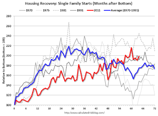
 This graph compares the current housing recovery (single family starts) to previous recoveries. The bottom is set to 100 for each housing cycle.
For the first several years, the current recovery (red) under performed previous recoveries.
Note: This doesn't even consider the depth of the current cycle (the deepest decline in housing starts since the Census Bureau started collecting data).
In 2012 I wrote:
With excess inventory, more foreclosures (especially in certain states), more consumer deleveraging, and tight lending standards, I expect this recovery to remains sluggish. The good news is - barring a significant policy mistake - this housing recovery will probably continue for several years (last for more years than usual).The current recovery (red) started slowly, but is still ongoing!


