by Calculated Risk on 2/02/2018 11:12:00 AM
Friday, February 02, 2018
Update: "Scariest jobs chart ever"
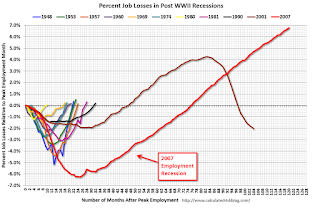
During and following the 2007 recession, every month I posted a graph showing the percent jobs lost during the recession compared to previous post-WWII recessions.
Some people started calling this the "scariest jobs chart ever". In 2009 it was pretty scary!
I retired the graph in May 2014 when employment finally exceeded the pre-recession peak.
I keep getting asked if I could post an update to the graph, and here it is through the January 2018 report.
This graph shows the job losses from the start of the employment recession, in percentage terms, compared to previous post WWII recessions. Since exceeding the pre-recession peak in May 2014, employment is now 6.8% above the previous peak.
Note: I ended the lines for most previous recessions when employment reached a new peak, although I continued the 2001 recession too on this graph. The downturn at the end of the 2001 recession is the beginning of the 2007 recession. I don't expect a downturn for employment any time soon (unlike in 2007 when I was forecasting a recession).


