by Calculated Risk on 3/09/2012 06:24:00 PM
Friday, March 09, 2012
Bank Failure #13 in 2012: New City Bank, Chicago, Illinois
... Playing corporation games
Write us off the page”
Excerpted by Soylent Green is People from M.Page, B. Taupin, D. Lambert, and P.Wolf.
From the FDIC: FDIC Approves the Payout of the Insured Deposits of New City Bank, Chicago, Illinois
As of December 31, 2011, New City Bank had $71.2 million in total assets and $72.4 million in total deposits. ... The FDIC estimates that the cost to the Deposit Insurance Fund (DIF) will be $17.4 million. New City Bank is the thirteenth FDIC-insured institution to fail in the nation this year, and the second in Illinois.No one wanted this one!
Freddie Mac: REO inventory declines 16% in 2011
by Calculated Risk on 3/09/2012 04:27:00 PM
This morning Freddie Mac reported results for Q4 and all of 2011. Freddie reported that they acquired 98,631 REO in 2011 (Real Estate Owned via foreclosure or deed-in-lieu), down from a record 128,238 in 2010.
Fannie disposed of a record 110,175 REO, up from 101,206 in 2010. Since Freddie disposed of more REO than they acquired, Freddie's REO inventory fell 16% in 2011.
Here is a table for the last two years:
| Freddie Mac REO Acquisitions and Dispositions | ||
|---|---|---|
| 2011 | 2010 | |
| Acquisitions | 98,631 | 128,238 |
| Dispositions | 110,175 | 101,206 |
| Net | -11,544 | 27,032 |
This has been true for most lenders - they sold more REO than they acquired in 2011 - not just Fannie, Freddie and the FHA.
The following graph shows REO inventory for Fannie, Freddie and the FHA.
 Click on graph for larger image.
REO inventory for Freddie increased slightly in Q4, but declined 16% in 2011. The combined REO inventory for Fannie, Freddie and the FHA declined 28.5% in 2011.
A few comments from Freddie:
Our single-family REO acquisitions in 2011 were most significant in the states of California, Michigan, Georgia, Florida, and Arizona, which collectively represented 43% of total REO acquisitions based on the number of properties. These states collectively represented 48% of total REO acquisitions in 2010. The states with the most properties in our REO inventory as of December 31, 2011 were Michigan and California. At December 31, 2011, our REO inventory in Michigan and California comprised 12% and 10%, respectively, of total REO property inventory, based on the number of properties.And on the REO-to-rental program:
On August 10, 2011, FHFA, in consultation with Treasury and HUD, announced a request for information seeking input on new options for sales and rentals of single-family REO properties held by Freddie Mac, Fannie Mae and FHA. According to the announcement, the objective of the request for information was to help address current and future REO inventory. The request for information solicited alternatives for maximizing value to taxpayers and increasing private investment in the housing market, including approaches that support rental and affordable housing needs. We are participating in discussions with FHFA and other agencies with respect to this initiative. It is too early to determine the impact this initiative may have on the levels of our REO property inventory, the process for disposing of REO property or our REO operations expense.
Trade Deficit increased in January to $52.6 Billion
by Calculated Risk on 3/09/2012 01:52:00 PM
Catching up: The Department of Commerce reports:
[T]otal January exports of $180.8 billion and imports of $233.4 billion resulted in a goods and services deficit of $52.6 billion, up from $50.4 billion in December, revised. January exports were $2.6 billion more thanThe trade deficit was above the consensus forecast of $49 billion.
December exports of $178.2 billion. January imports were $4.7 billion more than December imports of $228.7 billion.
The first graph shows the monthly U.S. exports and imports in dollars through January 2012.
 Click on graph for larger image.
Both exports and imports increased in January. Imports stalled in the middle of 2011, but increased towards the end of the year (seasonally adjusted). Exports are well above the pre-recession peak and up 8% compared to January 2011; imports just passed the pre-recession high and imports are up about 8% compared to January 2011.
The second graph shows the U.S. trade deficit, with and without petroleum, through December.
 The blue line is the total deficit, and the black line is the petroleum deficit, and the red line is the trade deficit ex-petroleum products.
Oil averaged $103.81 per barrel in January, down slightly from December.
Both exports and imports to the European Union were up year-over-year in January, with imports increasing faster.
Employment Summary and Discussion
by Calculated Risk on 3/09/2012 10:22:00 AM
This was a solid report, especially considering the upward revisions to payrolls for December and January. The better than normal weather helped, and there is still a long ways to go for a healthy labor market with solid wage gains.
Some analysts are comparing the last three months of payroll growth to early 2011, and arguing job growth will disappoint in the coming months. I also expect some slowing in employment growth since nice weather helps the most during the winter months. But there are reasons to expect better job growth overall this year - remember 2011 was negatively impacted by the tsunami, bad weather, high oil prices and the debt ceiling debate. We can't predict the weather, and oil prices are high again - but hopefully there will be no natural disasters, and also no threats of defaulting on the debt.
Plus housing has made the bottom turn, and even with a sluggish housing recovery, residential investment will add to economic growth in 2012. Also, the employment losses from state and local governments will probably end mid-year. In the last 6 months of 2011, there were 119,000 government jobs lost. This year, in the second half, job losses will probably be close to zero. As the BLS noted:
Government employment was essentially unchanged in January and February. In 2011, government lost an average of 22,000 jobs per month.On to the report: There were 227,000 payroll jobs added in February, with 233,000 private sector jobs added, and 6,000 government jobs lost. The unemployment rate was unchanged at 8.3%. U-6, an alternate measure of labor underutilization that includes part time workers and marginally attached workers, declined to 14.9% from 15.1% in January. This remains very high - U-6 was in the 8% range in 2007 - but this is the lowest level of U-6 since January 2009.
The participation rate increased to 63.9% (from 63.7%) and the employment population ratio increased slightly to 58.6%.
The change in December payroll employment was revised up from +203,000 to +223,000, and January was revised up from +243,000 to +284,000.
The average workweek was unchanged at 34.5 hours, and average hourly earnings increased 0.1%. "The average workweek for all employees on private nonfarm payrolls was unchanged at 34.5 hours in February. ... In February, average hourly earnings for all employees on private nonfarm payrolls rose by 3 cents, or 0.1 percent, to $23.31. Over the past 12 months, average hourly earnings have increased by 1.9 percent." This is sluggish earnings growth, and earnings are still being impacted by the large number of unemployed and marginally employed workers.
There are a total of 12.8 million Americans unemployed and 5.4 million have been unemployed for more than 6 months. Still very grim.
But overall this was a solid report.
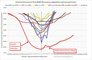
Percent Job Losses During Recessions
 Click on graph for larger image.
This graph shows the job losses from the start of the employment recession, in percentage terms - this time aligned at maximum job losses.
In the previous post, the graph showed the job losses aligned at the start of the employment recession.
Part Time for Economic Reasons
 From the BLS report:
 The number of persons employed part time for economic reasons (sometimes referred to as involuntary part-time workers) was essentially unchanged at 8.1 million in February. These individuals were working part time because their hours had been cut back or because they were unable to find a full-time job.The number of part time workers decreased slightly in February and is still very high.
These workers are included in the alternate measure of labor underutilization (U-6) that declined to 14.9% in February from 15.1% in January.
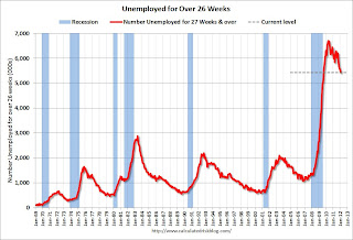
Unemployed over 26 Weeks
 This graph shows the number of workers unemployed for 27 weeks or more.
 According to the BLS, there are 5.426 million workers who have been unemployed for more than 26 weeks and still want a job. This was down from 5.518 million in January. This is very high, but this is the lowest number since January 2009.
When the number of long term unemployed and part time workers (for economic reasons) starts to fall sharply, and wages increase faster than inflation, this will feel much more like a recovery.
More graphs coming ...
February Employment Report: 227,000 Jobs, 8.3% Unemployment Rate
by Calculated Risk on 3/09/2012 08:30:00 AM
From the BLS:
Nonfarm payroll employment rose by 227,000 in February, and the unemployment rate was unchanged at 8.3 percent, the U.S. Bureau of Labor Statistics reported today.This graph shows the jobs added or lost per month (excluding temporary Census jobs) since the beginning of 2008.
...
Both the labor force and employment rose in February. The civilian labor force participation rate, at 63.9 percent, and the employment-population ratio, at 58.6 percent, edged up over the month.
...
The change in total nonfarm payroll employment for December was revised from +203,000 to +223,000, and the change for January was revised from +243,000 to +284,000.
 Click on graph for larger image.
Job growth started picking up early last year, but then the economy was hit by a series of shocks (oil price increase, tsunami in Japan, debt ceiling debate) - and now it appears job growth is picking up again.
The second graph shows the employment population ratio, the participation rate, and the unemployment rate. The unemployment rate was unchanged at 8.3% (red line).
 The Labor Force Participation Rate increased to 63.9% in February (blue line). This is the percentage of the working age population in the labor force. The slight increase in the participation rate is a little good news. The participation rate is well below the 66% to 67% rate that was normal over the last 20 years, although most of the decline is due to demographics.
The Employment-Population ratio increased to 58.6% in February (black line).
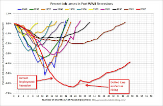
 The third graph shows the job losses from the start of the employment recession, in percentage terms. The dotted line is ex-Census hiring.
This shows the depth of the recent employment recession - much worst than any other post-war recession - and the relatively slow recovery due to the lingering effects of the housing bust and financial crisis.
This was another solid report, especially considering the upwards revisions to payrolls for December and January. More later ...


