by Calculated Risk on 2/01/2009 10:32:00 PM
Sunday, February 01, 2009
NY Times Example of a Toxic Asset
“To date, the banks have stuck their heads in the sand and demanded that they be paid the price of good apples for bad apples.”Vikas Bajaj and Stephen Labaton provide us with an example of the different values for a toxic assets in the NY Times: Risks Are Vast in Revaluing Tainted Assets
Lynn E. Turner, a former SEC chief accountant
The wild variations on the value of many bad bank assets can be seen by looking at one mortgage-backed bond recently analyzed by a division of Standard & Poor’s, the credit rating agency.To be worth even 38 cents on the dollar, this must be a senior tranche. The lower tranches have absorbed most of the losses so far, and that is why S&P is currently valuing the bond at 87 cents on the dollar, but any higher default assumptions, and the value of this bond will plummet. I'm amazed, given that these are no money down 2nds that the loss severity is only 40 percent.
The financial institution that owns the bond calculates the value at 97 cents on the dollar, or a mere 3 percent loss. But S.& P. estimates it is worth 87 cents, based on the current loan-default rate, and could be worth 53 cents under a bleaker situation that contemplates a doubling of defaults. But even that might be optimistic, because the bond traded recently for just 38 cents on the dollar, reflecting the even gloomier outlook of investors.
...
The bond is backed by 9,000 second mortgages used by borrowers who put down little or no money to buy homes. Nearly a quarter of the loans are delinquent, and losses on defaulted mortgages are averaging 40 percent. The security once had a top rating, triple-A.
But this illustrates the problem. If the bank marks the bond to market (38 cents), they will have to take huge losses. But if the government even pays the current S&P estimated value, the bank will have to write the bond down further, and the taxpayers will probably take huge losses too. Unless a bank has been very aggressive with their write downs, buying the toxic assets doesn't help - or is a gift from taxpayers to shareholders.
The article is excellent and covers several other related topics.
Falling Retail Rents in New York
by Calculated Risk on 2/01/2009 05:19:00 PM
From the NY Times: Recession Has Landlords of Retail Tenants Extending Discounts of Their Own
“There are an awful lot of empty stores, but what is more damaging for the landlords is that most of the other stores are empty — not empty physically, but people aren’t shopping,” [Mayor] Bloomberg said.The problems are just beginning for New York.
...
[M]any landlords find themselves in a bind because they paid stiff prices for property in recent years and need to cover hefty mortgage payments. On average, Manhattan landlords paid $3,348 per square foot for retail properties in 2008, compared with $538 per square foot in 2004, according to the brokerage Cushman & Wakefield.
...
While New York City’s retail vacancy rate has remained relatively low at 4.7 percent, it grew faster than in any other major city between the third quarter of 2007 and the third quarter of 2008, according to Marcus & Millichap Research Services.
And rents have started to drop even on busier shopping districts like Madison Avenue, where a Grubb & Ellis report issued last month predicted that rents could fall by as much as 30 percent this year.
Unemployment Forecast
by Calculated Risk on 2/01/2009 03:01:00 PM
Here is a preview of the January employment report (due Friday) from Rex Nutting at MarketWatch: Fifth straight month of heavy layoffs should push jobless rate to 7.5%
The axe fell on an expected half million jobs last month, economists say, and the only reason the job losses weren't larger is that weak hiring for temporary jobs in November and December meant fewer people were laid off in January.Over a year ago, I put together a forecast showing the effects of the recession would linger for some time, but that the headline unemployment rate (U-3) wouldn't exceed 8%. Still many more workers would be underemployed (as counted in U-6).
...
The unemployment rate is expected to rise to 7.5% in January from 7.2% in December. It would be the highest unemployment rate since 1992. Economists expect the jobless rate to hit nearly 9% by early next year.
The logic was related to the structure of the economy; historically layoffs in manufacturing drive the unemployment rate, and since a much smaller percentage of U.S. workers are now employed in manufacturing - and manufacturing never really recovered from the 2001 recession - I felt manufacturing layoffs like in the '50s or '70s would have less of an impact on overall employment. Also many more employees are moved to part time work these days (as opposed to lost jobs), and these employees aren't included in the headline unemployment rate (but are included in U-6).
For most of 2008 I tracked job losses in construction and retail, however the employment picture changed rapidly in September.
 Click on graph for larger image in new window.
This graph shows the cumulative changes in employment starting in August 2007 (red line is total nonfarm employment). Total employment peaked in December 2007, but the graph starts earlier to show the three key areas - construction, retail and manufacturing - that all saw earlier job losses.
For some time the total job losses were far less than the combined losses in construction, retail and manufacturing, suggesting other areas of the economy were doing OK.
However starting in September 2008, job losses in other areas of the economy started increasing rapidly.
The employment diffusion index from the BLS tells the same story.
 A diffusion index is a measure of the dispersion of change. This gives a feel for how widespread job gains and losses are across industries. The closer to 50, the more narrow the changes in employment.
Until September, the employment diffusion index was above 40, suggesting the job losses were limited to a few industries. However since then, especially in November and December, the diffusion index plummeted, suggesting job losses are now widespread.
With widespread job losses, the unemployment rate could move much higher. I've seen a number of forecasts for double digit unemployment in 2010 (even 12% or more). The U.S. economy hasn't seen double digit unemployment since the early '80s.
 This graph shows the unemployment rate and the year over year change in employment vs. recessions.
The unemployment rate rose to 7.2 percent in December; the highest level since January 1993.
And year over year employment is now strongly negative (there were 2.6 million fewer Americans employed in Dec 2008 than in Dec 2007).
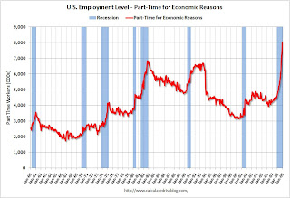 And not only has the unemployment rate risen sharply, but the number of workers only able to find part time jobs (or have had their hours cut for economic reasons) is now over 8 million for the first time ever (although the U.S. population has increased significantly since the early '80s).
So, even with less of an impact on unemployment from manufacturing job losses (as compared to the '50s or '70s) and more workers finding part time work, the unemployment rate will probably still move higher than 8% - and could well move much higher.
It is difficult to gage the impact of the Obama stimulus package on employment. As an example, with commercial real estate construction coming to a screeching halt, many more construction workers will lose their jobs in 2009. However this might be somewhat offset by more public construction projects.
I think double digit unemployment is now very possible, although I'll take the under 10% (at least for now).
Best to all. Football fans: Enjoy the game!
San Diego House "Deal of the Week"
by Calculated Risk on 2/01/2009 11:02:00 AM
The North County Times has a feature called "Deal of the Week".
House sells at 69 percent discount
This week the featured home is in Escondido (inland north county San Diego). The house is a 1000 Sq Ft, 2 BR, 1 BA, older home built in 1955. The house sold for $146 thousand in 1999.
During the bubble, the house for $420 thousand in 2006 (with 100% financing from subprime lender Argent Mortgage).
After foreclosure last year, the house sold to cash flow investors in November 2008 for $130 thousand (less than the 1999 price) and is currently being offered for rent.
This really shows the round trip in prices for low end properties in California.
Saturday, January 31, 2009
The Bailout Rap
by Calculated Risk on 1/31/2009 11:48:00 PM
For this video, hat tips to Gregg, and also Brad at the Charleston Market Report. Brad has a selection of housing related videos here.
Note: For some reason this video had me thinking of Vanilla Ice ... Oh well, enjoy ...
NYC: Rents "Falling Fast"
by Calculated Risk on 1/31/2009 07:06:00 PM
From the NY Times: A Month Free? Rents Are Falling Fast (hat tip Brian)
IN this painful economic climate of layoffs and shrinking investments, there is a sliver of positive news: it’s a good time to be a renter in New York City. Prices are falling, primarily in Manhattan, and concessions like a month of free rent are widespread.I live in a California beach community and there are usually very few rental units available. I went for a walk this morning, and I was amazed at all the "For Rent" and "For Lease" signs. The market is changing rapidly here too.
...
The steepest drop was in one-bedrooms, down 5.7 percent in buildings with doormen and 6.53 percent in buildings without. The only category that rose: rents for two-bedroom apartments in doorman buildings, up just a bit, by 0.61 percent. But these numbers, like most available data, represent asking rents rather than the final price. Anecdotal evidence suggests that some people are negotiating rents as much as 20 percent lower than the original prices asked by landlords. These figures also leave out incentives, like a month of free rent or a landlord’s paying the broker fee, which can add up to real savings.
On the rental market: Earlier this month I wrote about some of the supply and demand issues, see The Residential Rental Market
And not included in my summary post of January economic activity was this apartment data from the National Multi Housing Council (NMHC):
The stunning job losses and economic deterioration recorded over the past four months have eroded demand for apartments, putting the sector—like other real estate sectors and the economy itself—in a clearly "down" phase of the cycle, according to the National Multi Housing Council's (NMHC) latest Quarterly Survey of Apartment Market Conditions.

Click on graph for larger image in new window.
This graph shows the quarterly Apartment Tightness Index.
"The Market Tightness Index, which measures changes in occupancy rates and/or rents, declined sharply this quarter to 11 from 24. This is the third-lowest result on record, and the sixth straight quarter in which the index has been below 50."
It's a good time to be a renter.
Ramsey Su: Allow Foreclosures to Happen
by Calculated Risk on 1/31/2009 04:45:00 PM
My friend Ramsey Su writes in the WSJ: Why Be a Nation of Mortgage Slaves?
Preventing foreclosures has become a top priority of politicians, economists and regulators. In fact, allowing foreclosures to happen has merit ...Ramsey makes some very valid points:
If the intent is to help homeowners, then foreclosure is undoubtedly the best solution. Household balance sheets have been destroyed by taking on too much debt via the purchase of inflated assets. With so little savings, a household with negative equity almost implies negative net worth. Walking away from the mortgage immediately repairs the balance sheet.
Credit may be damaged, but homeowners can rebuild it. And by renting something they can afford, instead of the McMansion they cannot, homeowners are most likely to have some money left over each month that they can save toward a down payment on a house they can eventually afford.
...
What is the market telling us? Dataquick recently released December sales data for Southern California, once the hotbed of speculative excesses supported by nontraditional financing. Foreclosures now dominate sales. Prices are down. Sales volume is up. New home construction is down. These are beautiful textbook illustrations of supply and demand driving price and market equilibrium.
...
The media should interview those who had been foreclosed upon. Do they feel sorry or relieved? Are they rebuilding their credit, not to mention their lives? Do they miss the pressure of having to make payments they cannot afford on a McMansion that belongs to the lender?
CNBC: "Bad Bank" Possible by Next Week
by Calculated Risk on 1/31/2009 01:44:00 PM
From CNBC: 'Bad Bank' Run By FDIC Possible By Next Week: Source
The talks are said to have yielded agreement that the FDIC would run the bad bank, according to an source. ... Thursday could be the announcement day.There is more in the article, but not really anything new.
Meanwhile the WSJ is reporting: ECB Drawing Up ‘Bad Bank’ Guidelines
The European Central Bank is drawing up guidelines for European governments that are considering so-called “bad banks” to house banks’ toxic assets. The ECB is also working on guidelines for European governments that plan to guarantee toxic assets remaining on banks’ books, another form of bank bailout.It looks like the Bad Bank idea is moving forward ...
Both sets of guidelines are being drawn up with the European Commission. The ECB hopes the guidelines can help avoid competitive one-upmanship across the 27-nation European Union as nations seek to shore up struggling banks.
The ECB, which makes monetary policy for the 16 countries that share the euro currency, has no power to enforce any guidelines it develops.
January Economic Summary in Graphs
by Calculated Risk on 1/31/2009 01:44:00 AM
Here is a collection of 20 real estate and economic graphs from January ... New Home Sales in December
Click on graph for larger image in new window.
The first graph shows monthly new home sales (NSA - Not Seasonally Adjusted).
Notice the Red columns for 2008. This is the lowest sales for December since 1966. (NSA, 23 thousand new homes were sold in December 2008, 23 thousand were sold in December 1966). As the graph indicates, sales in 2008 are substantially worse than the previous years. From: Record Low New Homes Sales in December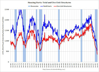 Housing Starts in December
Total housing starts were at 550 thousand (SAAR) in December, by far the lowest level since the Census Bureau began tracking housing starts in 1959.
Single-family starts were at 398 thousand in December; also the lowest level ever recorded (since 1959). Single-family permits were at 363 thousand in December, suggesting single family starts may fall even further next month. From: Housing Starts at All Time Low 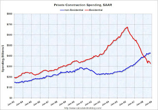 Construction Spending in November
This graph shows private residential and nonresidential construction spending since 1993.
Nonresidential spending held up as builders completed projects. This showed up in the Q4 GDP report too (non-residential investment in structures was off only slightly in Q4). From: Construction Spending Declines in November Strip Mall Vacancy Rate
REIS reported: "At neighborhood and community shopping centers, the vacancy rate rose to 8.9 percent from 8.4 percent in the third quarter, the highest since Reis began publishing quarterly data in 1999."
This graph shows the strip mall vacancy rate since Q2 2007. Note that the graph doesn't start at zero to better show the change. Strip mall vacancy rates are headed for double digits this year. From: Mall Vacancies Reach 10-Year High  December Employment Report
This graph shows the unemployment rate and the year over year change in employment vs. recessions. The unemployment rate rose to 7.2 percent; the highest level since January 1993.
Nonfarm payrolls decreased by 524,00 in December, and November payrolls were revised down to a loss of 584,000 jobs. The economy lost over 1.5 million jobs in Q4 alone! From: Employment Declines Sharply, Unemployment Rises to 7.2 Percent 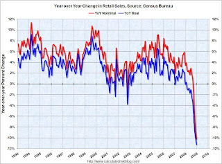 December Retail Sales
This graph shows the year-over-year change in nominal and real retail sales since 1993.
Although the Census Bureau reported that nominal retail sales decreased 10.2% year-over-year (retail and food services decreased 9.8%), real retail sales declined by 11.3% (on a YoY basis). This is the largest YoY decline since the Census Bureau started keeping data. From: Retail Sales Collapse in December  LA Port Traffic in December
This graph shows the combined loaded inbound and outbound traffic at the ports of Long Beach and Los Angeles in TEUs (TEUs: 20-foot equivalent units or 20-foot-long cargo container).
Inbound traffic was 19% below last December. For the LA area ports, outbound traffic continued to decline in December, and was 30% below the level of December 2007. From: LA Area Port Traffic Collapses in December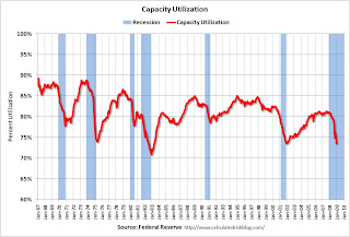 December Capacity Utilization
Capacity utilization fell to 73.6% from 75.2%. This is the lowest level since December 2001.
The significant decline in capacity utilization suggests less investment in non-residential structures for some time. From: Capacity Utilization and Industrial Production Cliff Diving  Vehicle Sales
This graph shows monthly vehicle sales (autos and trucks) as reported by the BEA at a Seasonally Adjusted Annual Rate (SAAR).
This shows that sales have plunged to just over a 10 million annual rate - the lowest rate since the early '80s recession. From: Vehicle Sales NAHB Builder Confidence Index in January
This graph shows the builder confidence index from the National Association of Home Builders (NAHB).
The builder confidence index was at 8 in January, a new record low. From: NAHB Housing Market Index Falls to New Record Low  Architecture Billings Index for December
The American Institute of Architects (AIA) reported the December ABI rating was 36.4, up from the 34.7 mark in November (any score above 50 indicates an increase in billings).
From: Architecture Billings Index Near Record Low Vehicle Miles driven in November
This graph shows the annual change in the rolling 12 month average of U.S. vehicles miles driven. Note: the rolling 12 month average is used to remove noise and seasonality.
By this measure, vehicle miles driven are off a record 3.7% Year-over-year (YoY); the decline in miles driven is worse than during the early '70s and 1979-1980 oil crisis. As the DOT noted, miles driven in November 2008 were 5.4% less than November 2007, so the YoY change in the rolling average may get worse. From: DOT: U.S. Vehicle Miles Driven Declines Sharply Existing Home Sales in December
This graph shows existing home sales, on a Seasonally Adjusted Annual Rate (SAAR) basis since 1993.
Sales in December 2008 (4.74 million SAAR) were 6.5% higher than last month, and were 3.5% lower than December 2007 (4.91 million SAAR). From: Existing Home Sales Increase in December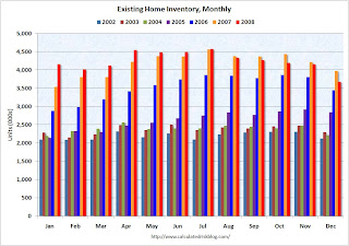 Existing Home Inventory
This graph shows inventory by month starting in 2002. Inventory levels were flat for years (during the bubble), but started increasing at the end of 2005.
Inventory levels increased sharply in 2006 and 2007, but have been close to 2007 levels for most of 2008. In fact inventory for the last five months was below the levels of last year. This might indicate that inventory levels are close to the peak for this cycle. From: Existing Home Sales (NSA)  Case Shiller House Prices for November
This graph shows the nominal Composite 10 and Composite 20 indices (the Composite 20 was started in January 2000).
The Composite 10 index is off 26.6% from the peak. The Composite 20 index is off 25.1% from the peak. From: Case-Shiller: House Prices Fall Sharply in November 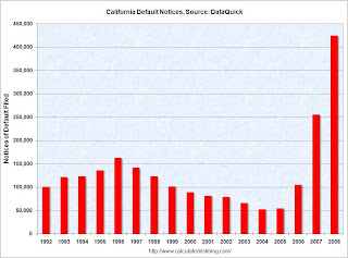 California Notices of Default
This graph shows the Notices of Default (NOD) by year in California from DataQuick.
There were a record 423,962 NODs filed in 2008, breaking the old record of 254,824 NODs in 2007.
The previous record had been in 1996 with 162,678 NODs filed. That was during the previous California housing bust in the early to mid-90s. From: DataQuick: Temporary Drop in California Foreclosure Activity ATA Truck Tonnage Index
"The American Trucking Associations’ advanced seasonally adjusted For-Hire Truck Tonnage Index plunged 11.1 percent in December 2008, marking the largest month-to-month reduction since April 1994, when the unionized less-than-truckload industry was in the midst of a strike. December’s drop was the third-largest single-month drop since ATA began collecting the data in 1973." From: Truck Tonnage Index: Cliff Diving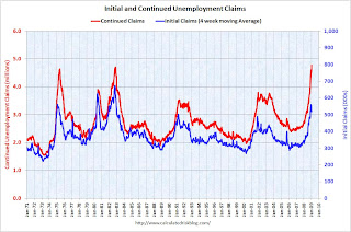 Unemployment Claims
This graph shows weekly claims and continued claims since 1971.
The four week moving average is at 542,500; still below the recent peak of 558,750
in December.
Continued claims are now at 4.78 million - a new record (not adjusted for population) - just above the previous all time peak of 4.71 million in 1982. From: Continued Unemployment Claims at Record High  Restaurant Performance Index for December
"The Association's Restaurant Performance Index (RPI) - a monthly composite index that tracks the health of and outlook for the U.S. restaurant industry - stood at 96.4 in December, down 0.2 percent from November and its 14th consecutive month below 100."
From: Restaurant Performance Index at New Low New Home Sales
This graph shows New Home Sales vs. recessions for the last 45 years. New Home sales have fallen off a cliff.
From: Record Low New Homes Sales in December
How I Learned to Stop Worrying and Love the TARP
by Calculated Risk on 1/31/2009 12:41:00 AM
Remember Dr. Evil and Mini-Me? Here is another one ... (hat tip bentway, Chancels)
Click on photo for larger image in new window.
Does Treasury Secretary Tim Geithner look like Peter Sellers in Dr. Strangelove?
Maybe ...


