by Calculated Risk on 3/18/2009 12:10:00 PM
Wednesday, March 18, 2009
Charlie Rose: AIG and Meredith Whitney on Banks
Note: If embed doesn't work, the video is here.
From Transcript:
CHARLIE ROSE: Listen, you saw this early certainly in terms of the banks, and you got a lot of credit for that. Have we not seen the worst? Is the worst still to come, or have we passed some point of beginning to understand and just waiting for the plan to get us back on track?
MEREDITH WHITNEY: I really believe the longer we wait, the longer we head down this path -- well, the math is the worst is ahead of us. And...
CHARLIE ROSE: So the end of 2009 or beyond?
MEREDITH WHITNEY: At least the end of 2009. Look, you have credit continuing being pulled from the system, and until it stabilizes, there is nowhere to go but down. And from an unemployment perspective, no one is pricing in low, mid teens unemployment in any of their assumptions. So it is just a question of not if the banks need to raise capital, it’s when, and, you know, let’s get some capital back in the system by looking at who can provide it, like the local banks. We will go back to a time that was and not try to preserve a system that is and -- or was more recently and will never be again.
You are throwing good money down black holes ...
emphasis added
Architecture Billings Index Near Record Low
by Calculated Risk on 3/18/2009 09:14:00 AM
The American Institute of Architects reports: Architecture Billings Index Continues to Point to Difficult Conditions
A second headline reads: "No region or building sector immune from prolonged economic downturn" Click on graph for larger image in new window.
Following another historic low score in January, the Architecture Billings Index (ABI) was up two points in February. As a leading economic indicator of construction activity, the ABI reflects the approximate nine to twelve month lag time between architecture billings and construction spending. The American Institute of Architects (AIA) reported the February ABI rating was 35.3, up from the 33.3 mark in January, but still pointing to a general lack of demand for design services (any score above 50 indicates an increase in billings). The new projects inquiry score was 49.5.Note that historically there is an "approximate nine to twelve month lag time between architecture billings and construction spending". The ABI fell off a cliff in early 2008 and that decline started showing up in non-residential construction spending in Q4.
“Despite a higher score than last month, we are likely to see light demand for new construction projects through much of the year,” said AIA Chief Economist Kermit Baker, PhD, Hon. AIA. “There is hope that the stimulus bill will result in more project activity, but that is also dependent on banks easing lending standards in the months ahead. Still, the improvement in the inquiries index does provide hope that some stalled projects will resurface in the near future.”
The ABI fell off a 2nd cliff in late 2008, and that will show up mid-2009.
Since the index is still well below 50 (anything below 50 means contraction in billings), this suggests non-residential investment in structures will decline all year (no surprise!).
CPI Increases 0.4% mostly due to gasoline
by Calculated Risk on 3/18/2009 08:50:00 AM
From the BLS: Consumer Price Index Summary
On a seasonally adjusted basis, the CPI-U increased 0.4 percent in February after rising 0.3 percent in January. The energy index rose 3.3 percent in February following a 1.7 percent increase in January as the gasoline index rose 8.3 percent in February after a 6.0 percent increase in January. ... About two-thirds of the all items increase was due to the rise in the gasoline index.Core inflation increased 0.2 percent.
For some reason owners' equivalent rent increased even though rents are falling in most areas:
The indexes for rent and owners' equivalent rent both rose 0.1 percent in February after increasing 0.3 percent in January.This will probably lower the concern about deflation a little.
Tuesday, March 17, 2009
Jet Blue Pokes Fun at CEOs
by Calculated Risk on 3/17/2009 11:59:00 PM
The new Jet Blue ad campaign is pretty funny. You can see the three parts here. (ht Dave)
Here is part I:
Housing: Two Bottoms
by Calculated Risk on 3/17/2009 09:21:00 PM
Note: I've added a "ShareThis" button to the posts, and I'm now on Twitter.
In my previous post I discussed the question: Housing Starts: Is this the bottom?
We don't know the answer yet.
But some readers are confusing a bottom in housing starts with a bottom in pricing. It doesn't works that way!
There will be two distinct bottoms for housing:
1) First single-family housing starts and new home sales will bottom.
and then followed some time later ...
2) Prices for existing homes will bottom.
Just about every housing bust follows this pattern. The bottom in prices could be a year, or two, or more away. It is way too early to try to call the bottom in prices. House prices will almost certainly fall all year and probably next year too. Prices will continue to fall. Prices are not at the bottom.
Sorry for repeating myself.
Also, it is theoretically possible that single-family housing starts (off 80% from peak) and new home sales (off 78% from peak) could go to zero - but unlikely. Sometime this year housing starts and new home sales will probably bottom, but that doesn't indicate a bottom for house prices.
Housing Starts: Is this the Bottom?
by Calculated Risk on 3/17/2009 04:25:00 PM
Update: Please don't confuse a bottom in single family housing starts with a bottom in house prices! See next post: Housing: Two Bottoms.
The title to this post would have been laughable in 2008 or 2007, but as I noted in Looking for the Sun, there is a reasonable chance housing starts will bottom sometime this year - so I suppose it is not too early to start looking.
A few key points:
 Click on graph for larger image in new window.
From the Census Bureau: "The seasonally adjusted estimate of new houses for sale at the end of January was 342,000. This represents a supply of 13.3 months at the current sales rate."
But the increase in Months of Supply has been driven by the denominator (sales), even though the numerator (inventory) has been falling steadily. note: Months of supply = inventory / sales.
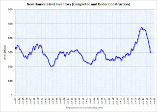
 The second graph shows the level of hard inventory for new homes (completed plus under construction). With starts below sales, hard inventory has been falling for some time.
 Unless sales fall further, the months of supply should start to decline even with the current level of starts.
And this brings up a key point:
However it is possible to compare "Single Family Starts, Built for Sale" to New Home sales on a quarterly basis. The quarterly report shows there were 65,000 single family starts, built for sale, in Q4 2008 and that is less than the 82,000 new homes sold for the same period. This data is Not Seasonally Adjusted (NSA). This suggests homebuilders were selling more homes than they are starting – but not by much.
However starts have fallen much further in Q1 (almost 25% from Q4) although sales have fallen too (we only have January data for sales so far).
Note: new home sales are reported when contracts are signed, so it is appropriate to compare sales to starts (as opposed to completions), although this isn’t perfect because homebuilders have recently been stuck with “unintentional spec homes” because of the high cancellation rates.
 This graph provides a quarterly comparison of housing starts and new home sales. In 2005, and most of 2006, starts were higher than sales, and inventories of new homes rose sharply. For the last several quarters, starts have been below sales – and new home inventories have been falling - but it continues to be a race to the bottom between starts and sales.
 Of course, unless sales stabilize soon, starts might have to fall further.
Stock Market Update
by Calculated Risk on 3/17/2009 04:12:00 PM
Another up day with the NASDAQ up over 4%, and the S&P up 3.2%. The S&P 500 is now up 15% from the closing lows. Here are a couple of graphs: Click on graph for larger image in new window.
The first graph is from Doug Short of dshort.com (financial planner): "Four Bad Bears".
Note that the Great Depression crash is based on the DOW; the three others are for the S&P 500.
The second graph shows the S&P 500 since 1990. 
The dashed line is the closing price today.
This puts the 15% rally into perspective - the S&P is still off more than 50% from the 2007 high.
Thornburg Mortgage may file bankruptcy
by Calculated Risk on 3/17/2009 03:40:00 PM
From Reuters: Thornburg Mortgage may file Chapter 11 bankruptcy
Thornburg Mortgage ... a large and troubled provider of "jumbo" mortgage loans, on Tuesday said it may file for Chapter 11 bankruptcy protection.We're all subprime now!
...
A bankruptcy filing would make Thornburg one of the largest U.S. mortgage providers to seek protection from creditors since the housing slump began ...
Thornburg has specialized in making mortgages larger than $417,000 to borrowers with good credit ...
Last March, Thornburg arranged a $1.35 billion bailout from the distressed debt investor MatlinPatterson Global Advisors LLC and other investors to stay out of bankruptcy.
According to a Tuesday regulatory filing, MatlinPatterson surrendered all of its Thornburg common stock -- 120.8 million shares -- on March 12 and 16 without any compensation. ...
DataQuick: SoCal Home Sales Up, Foreclosure Resales 56.4% of Market
by Calculated Risk on 3/17/2009 01:18:00 PM
Note: I ignore the median price data because it is skewed by the mix of homes sold. A repeat sales index like Case-Shiller is a better indicator of price changes.
From DataQuick: Southland home sales outpace last year again; median price steady
Southland home sales stayed above year-ago levels for the eighth consecutive month in February ... Market activity was dominated by bargain-hunting in affordable neighborhoods while buying and selling in more expensive established areas remained largely on hold ...Sales are up because of foreclosure resales in less expensive neighborhoods. Meanwhile, sales in "more expensive established areas" have slowed to a trickle. This build up in supply will eventually lead to more price declines in the expensive areas ...
A total of 15,231 new and resale homes sold in Los Angeles, Riverside, San Diego, Ventura, San Bernardino and Orange counties last month. That was essentially unchanged from 15,227 for January, and up 41.3 percent from 10,777 for February 2008, according to MDA DataQuick of San Diego.
...
Regionwide, foreclosure resales accounted for 56.4 percent of February’s resales activity, which was the same as the revised January figure and up from 36.2 percent in February 2008.
Credit Crisis Indicators
by Calculated Risk on 3/17/2009 10:58:00 AM
Here is a quick look at a few credit indicators:
First, the British Bankers' Association reported that the three-month dollar Libor rates were fixed at 1.30%, down from 1.31% on Monday. This has been a slight improvement over the last week. Click on table for larger image in new window.
The first graph shows the spread between 30 year Moody's Aaa and Baa rated bonds and the 30 year treasury.
There has been some increase in the spread the last few weeks, but the spread is still way below the recent peak. The spreads are still very high, even for higher rated paper, but especially for lower rated paper.
The Moody's data is from the St. Louis Fed:
Moody's tries to include bonds with remaining maturities as close as possible to 30 years. Moody's drops bonds if the remaining life falls below 20 years, if the bond is susceptible to redemption, or if the rating changes.
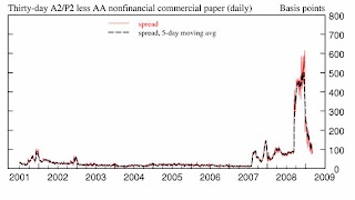
 There has been improvement in the A2P2 spread. This has declined to 0.84. This is far below the record (for this cycle) of 5.86 after Thanksgiving, but still above the normal spread.
This is the spread between high and low quality 30 day nonfinancial commercial paper.
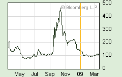
 | Meanwhile the TED spread has decreased a little over the last week, and is now at 107.5. This is the difference between the interbank rate for three month loans and the three month Treasury. The peak was 463 on Oct 10th and a normal spread is around 50 bps. |
 This graph shows the at the Merrill Lynch Corporate Master Index OAS (Option adjusted spread) for the last 2 years.
This is a broad index of investment grade corporate debt:
The Merrill Lynch US Corporate Index tracks the performance of US dollar denominated investment grade corporate debt publicly issued in the US domestic market.The recent surge in this index was a cause for alarm, but the index appears to have stabilized over the last week.
All of these indicators are still too high, but at least none of them are increasing this week.


